
Responsive Website & Branding
for Guidance and Spiritual services
Project Overview
I assisted Harriet's Tarot, a venture focused on offering guidance and spiritual services.
I were commissioned with information architecture, competitive analysis, user research, wire-framing and the web design, such as user experience (UX), user interface design (UI) and web development. Also extensive quality assurance (QA) was provided along the way, including launch and post-launch maintenance.
My Role: Research Designer, UX/UI Designer, Graphic Designer
Duration: 3 months
Tools: Figma, Zoom, Trello, Framer, Photoshop
Platform: Responsive desktop and mobile website
Discovering the Design Process
Discover:
Competitive Analysis
User Research
Define:
User Flow Diagram
MoSCoW Priority Matrix
Develop
Rapid Sketching
Prototyping
User Testing
Deliver:
Ideation
Style Guide
Hi-Fi Prototype
DISCOVERING the Problem Space
The strategy or brand development and website building, as guided by graphic design and UX/UI design principles, involved creating a cohesive visual identity that resonates with Harriet's Tarot's spiritual essence.
Competitive Research and User Research
I started with competitive analysis to explore competitors and conducted user research to identify users’ needs, goals and pain points.
Research Findings:
Based on my initial research, I compiled a list of insights that would serve as the foundation and guide our next design decisions.
Access to Trusted Services: The research findings highlighted a strong desire to connect with genuine and dependable tarot readers and spiritual advisors.
Ease of Booking: They seek a service that prioritizes a simple and hassle-free booking process, allowing them to swiftly schedule sessions.
Personalized Services: Tailored reading and spiritual guidance for their specific questions and concerns are of utmost importance.
Information and Insights: To build trust among users, comprehensive information about Harriet's services, her background, and what each session entails is essential.
Privacy and Confidentiality: Users also emphasize the importance of privacy and confidentiality when it comes to their personal and spiritual matters.
Payment Security: A secure and trustworthy payment process is considered essential to instill confidence, ensuring the protection of their financial information.
Convenience: Flexibility in session scheduling, accommodating different time zones and availability, is highly valued.
Feedback and Reviews: Users express a strong desire for reviews and feedback from previous clients to evaluate Harriet's credibility and the effectiveness of her expertise.
The problem Statement:
Users in search of trustworthy tarot and spiritual services require a platform that streamlines the booking process while offering personalized guidance and ensuring their privacy.
defining and DEVELOPING SOLUTIONS
After formulating the problem statement, it became my north star for making subsequent design choices. In order to make efficient use of my time and resources, I ranked features by their importance in addressing the issue.
Using a Moscow map, I organized features for the platform's MVP (Minimum Viable Product), with a primary focus on meeting users' needs.
I embarked on rapid sketching, endeavoring to explore a broad spectrum of ideas and solutions, ranging from conventional to unconventional, all captured on paper.
Ultimately, I arrived at website concept that delivers:
Landing Page for Harriet's Services: Landing page highlighting an array of services offered by Harriet, providing a glimpse of what awaits users.
About Harriet: Section where they learn about Harriet’s unique story and the inspiration behind her services.
Services Showcase: Section offering detailed descriptions of each service, along with transparent pricing and convenient payment information.
Seamless Scheduling: Scheduling method via Calendly, streamlining the process to connect with Harriet’s services.
Delivering Solutions
To address user’s needs, we selected brand adjectives that embody a sense of spirituality, feeling of trust and openness.
Brand Adjectives:
Mystical
|
Welcoming
|
Trustworthy
Primary & Secondary colors
Harriet’s proficiency in calligraphy led her to opt for a gothic font, infusing her brand with an aura of mystique and spirituality. Additionally, she conveyed a strong inclination for the color purple.
Purple is associated with qualities such as spirituality, and mysticism. It is a color that can inspire a sense of introspection and inner wisdom, aligning perfectly with the spiritual services offered by Harriet's Tarot.
After visual research I choose the hex code #2C1537. This color embodies a profound shade of purple, akin to aubergine. It exudes an air of sophistication, veiled mystery, and depth, reminiscent of twilight or the velvety night sky.
#2C1537
|
CMYK
Cyan: 20
Magenta: 62
Yellow: 0
Key (Black): 78
|
RGB
Red: 44
Green: 21
Blue: 55
For the CTA (Call to Action), I introduced a vibrant yellow color. #FFBB00 was strategically chosen to create a striking contrast with the aubergine purple I've chosen for Harriet’s brand.
#FFBB00
|
CMYK
Cyan: 0
Magenta: 27
Yellow: 100
Key (Black): 0
|
RGB
Red: 255
Green: 187
Blue: 0
For titles and body copy, I selected an anthracite grey, #3D3D3D. It is a deep anthracite grey, embodying a timeless and classic essence. It's often associated with formality and neutrality, lending a sense of balance and professionalism our designs.
#3D3D3D
|
CMYK
Cyan: 0
Magenta: 0
Yellow: 0
Key (Black): 76
|
RGB
Red: 61
Green: 61
Blue: 61
In the hero section, I opted for a lighter purple for sub-headers, utilizing #D9C5E8. It is a soft and graceful shade of lavender. It radiates a calming and serene aura, making it perfect for creating a soothing atmosphere.
#D9C5E8
|
CMYK
Cyan: 6
Magenta: 15
Yellow: 0
Key (Black): 9
|
RGB
Red: 217
Green: 197
Blue: 232
The color #F5F5F5, a off-white shade, serves as the dominant hue on the website, primarily for titles and headers.
#F5F5F5
|
CMYK
Cyan: 0%
Magenta: 0%
Yellow: 0%
Key (Black): 4%
|
RGB
Red: 245
Green: 245
Blue: 245
text Style
After conducting additional visual research and considering various typefaces, we settled on 3 distinctive typefaces to perfectly capture the essence of Harriet's Tarot.
For the logo, I opted for the typeface "Forestine", a blackletter with a gothic style with intricate characteristics, which align beautifully with the mystique and spirituality of the brand.
|
For the website headlines, we selected "Merienda" a typeface known for its soft shapes, slight condensation, and inviting rhythm.
Aa
|
Merienda
To maintain a contemporary and legible appearance for the website, I employed "Laila" as our third typeface. Laila is a sans-serif typeface, complete with brush terminals, gives it a 21st-century feel. This typeface looks especially appealing for shorter passages of text and perfect for the body copy.
Aa
|
Laila
These carefully selected typefaces and the color psychology of purple contribute to the visual identity of Harriet's Tarot, creating a unique and inviting online presence that resonates with the brand's spiritual and contemporary essence.
The Logo
|
The "Forestine" typeface was a fitting choice to reflect Harriet's passion for calligraphy.
The letter sizes were adjusted to enhance the overall dynamism and balance.
Variations
|
|
Illustrations
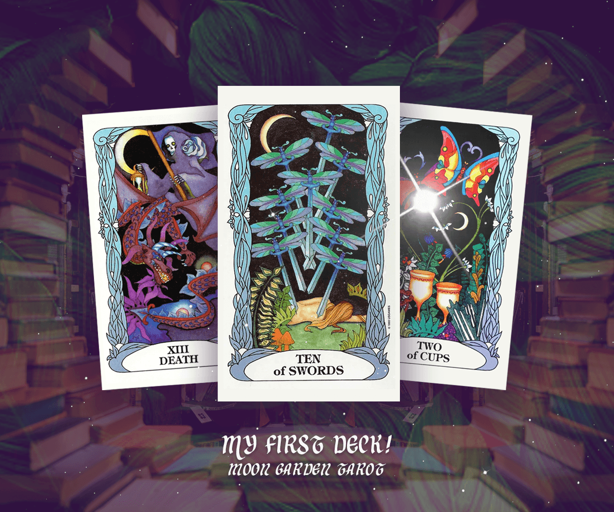
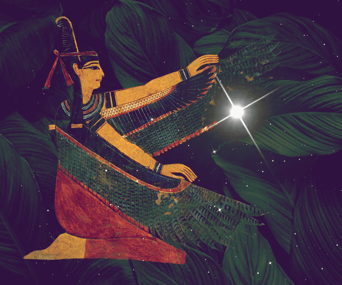
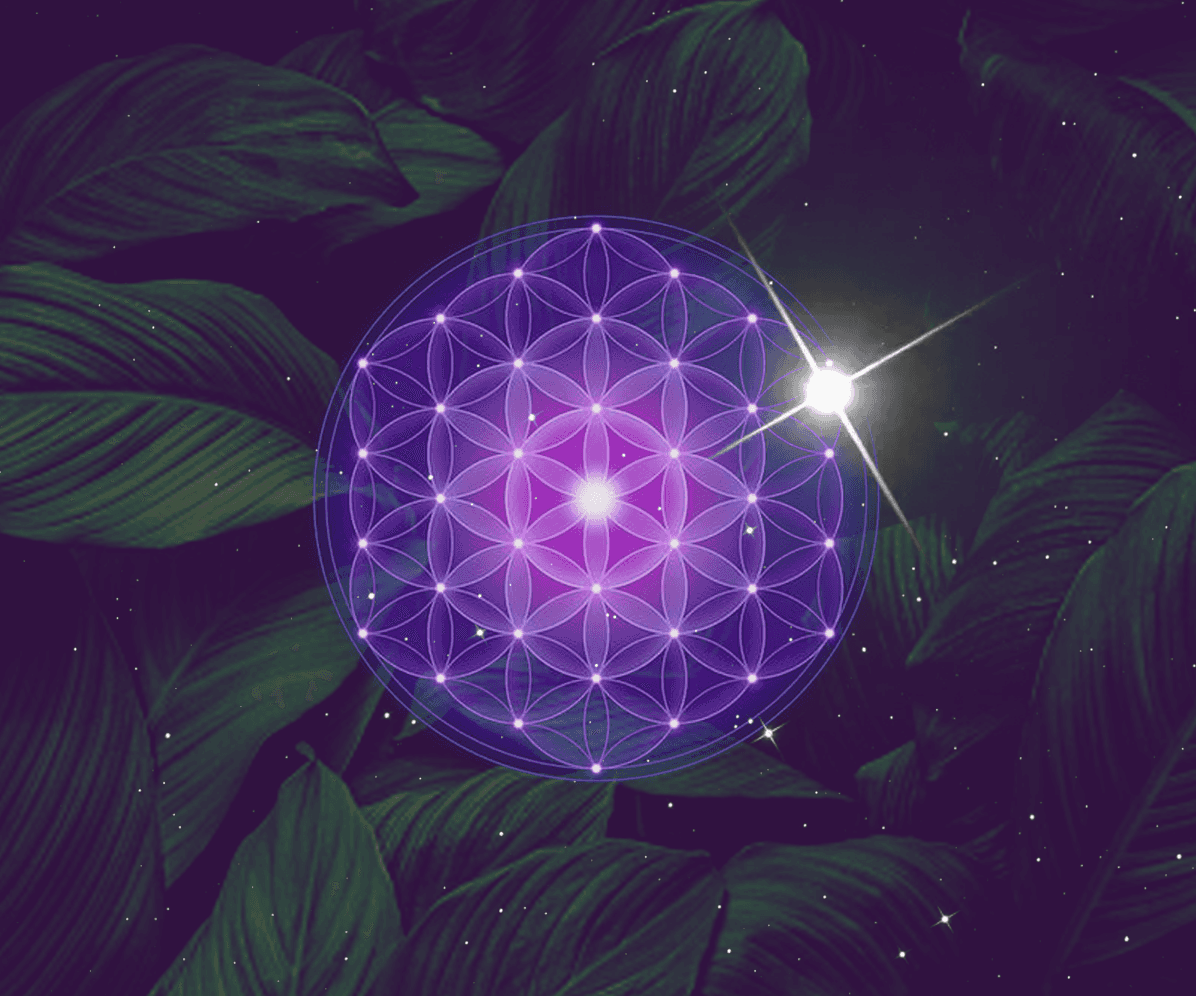
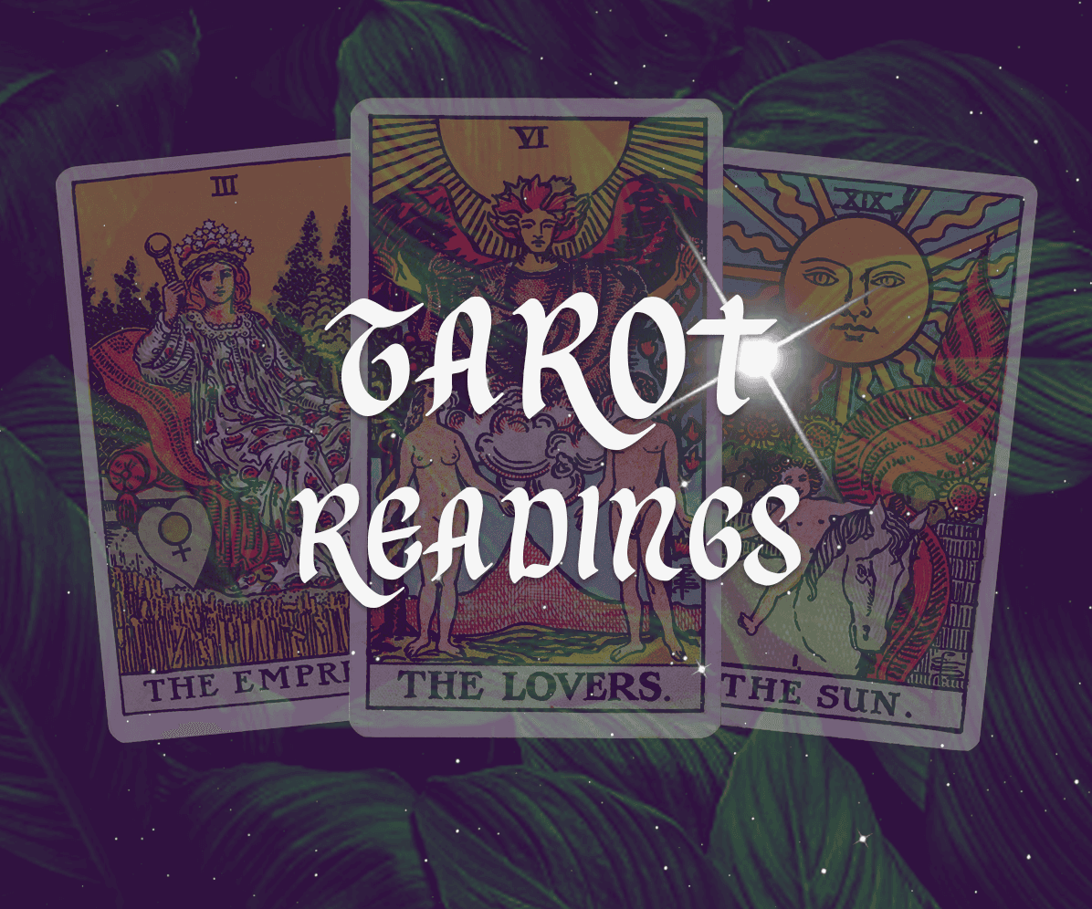
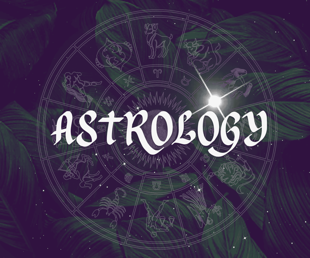
I created the illustrations using Adobe Photoshop, incorporating the chosen shade of purple as the background. I added plant leaves with transparency to create a grounding effect.
By using a combination of purple and green (represented by plant leaves) and an additional texture of a night-sky to create depth. I aimed to achieve a dynamic and visually appealing contrast. These two colors are complementary on the color wheel.
The combination of purple and green can convey a sense of balance between the spiritual and the natural, making it suitable for brands or designs that aim to connect with both the mystical and the organic aspects of life.
illustrations: Landing page
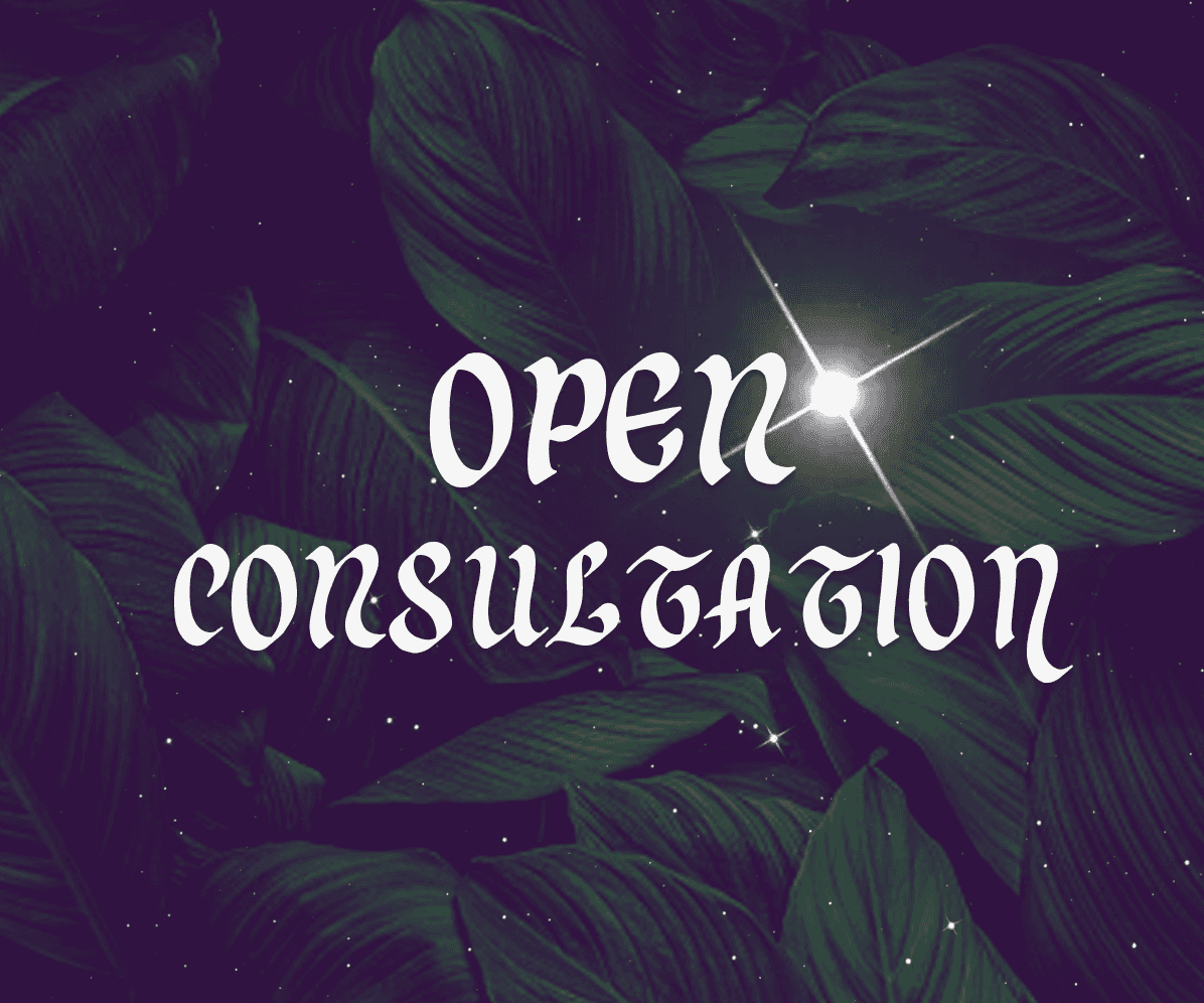

illustrations: about Harriet section


Conclusion
In this three-month project, I took on the roles of research designer, UX/UI designer, and graphic designer to build a responsive website for Harriet’s Tarot. My focus was on addressing users' primary needs, including simplifying the booking process, providing personalized guidance, ensuring privacy, and offering a secure, trustworthy experience. Through thoughtful brand development, I crafted a visual identity that aligns with Harriet’s spiritual essence, resulting in a user-centered platform that genuinely resonates with her audience.
Takeaways:
Simplified booking process to streamline user experience and encourage seamless scheduling.
Emphasized personalized, one-on-one spiritual guidance tailored to individual user needs.
Prioritized user privacy and confidentiality, creating a trustworthy and secure environment.
Integrated a secure payment system to instill user confidence in the service.
Developed a brand identity that embodies spirituality and trust, using color psychology and typeface selection.
Created a responsive, mobile-first website that ensures accessibility across devices.
Incorporated user feedback and competitive analysis into every stage of design, ensuring a user-centered approach.


Responsive Website & Branding
for Guidance and Spiritual services
Project Overview
I assisted Harriet's Tarot, a venture focused on offering guidance and spiritual services.
I were commissioned with information architecture, competitive analysis, user research, wire-framing and the web design, such as user experience (UX), user interface design (UI) and web development. Also extensive quality assurance (QA) was provided along the way, including launch and post-launch maintenance.
My Role: Research Designer, UX/UI Designer, Graphic Designer
Duration: 3 months
Tools: Figma, Zoom, Trello, Framer, Photoshop
Platform: Responsive desktop and mobile website
Discovering the Design Process
Discover:
Competitive Analysis
User Research
Define:
User Flow Diagram
MoSCoW Priority Matrix
Develop
Rapid Sketching
Prototyping
User Testing
Deliver:
Ideation
Style Guide
Hi-Fi Prototype
DISCOVERING the Problem Space
The strategy or brand development and website building, as guided by graphic design and UX/UI design principles, involved creating a cohesive visual identity that resonates with Harriet's Tarot's spiritual essence.
Competitive Research and User Research
I started with competitive analysis to explore competitors and conducted user research to identify users’ needs, goals and pain points.
Research Findings:
Based on my initial research, I compiled a list of insights that would serve as the foundation and guide our next design decisions.
Access to Trusted Services: The research findings highlighted a strong desire to connect with genuine and dependable tarot readers and spiritual advisors.
Ease of Booking: They seek a service that prioritizes a simple and hassle-free booking process, allowing them to swiftly schedule sessions.
Personalized Services: Tailored reading and spiritual guidance for their specific questions and concerns are of utmost importance.
Information and Insights: To build trust among users, comprehensive information about Harriet's services, her background, and what each session entails is essential.
Privacy and Confidentiality: Users also emphasize the importance of privacy and confidentiality when it comes to their personal and spiritual matters.
Payment Security: A secure and trustworthy payment process is considered essential to instill confidence, ensuring the protection of their financial information.
Convenience: Flexibility in session scheduling, accommodating different time zones and availability, is highly valued.
Feedback and Reviews: Users express a strong desire for reviews and feedback from previous clients to evaluate Harriet's credibility and the effectiveness of her expertise.
The problem Statement:
Users in search of trustworthy tarot and spiritual services require a platform that streamlines the booking process while offering personalized guidance and ensuring their privacy.
defining and DEVELOPING SOLUTIONS
After formulating the problem statement, it became my north star for making subsequent design choices. In order to make efficient use of my time and resources, I ranked features by their importance in addressing the issue.
Using a Moscow map, I organized features for the platform's MVP (Minimum Viable Product), with a primary focus on meeting users' needs.
I embarked on rapid sketching, endeavoring to explore a broad spectrum of ideas and solutions, ranging from conventional to unconventional, all captured on paper.
Ultimately, I arrived at website concept that delivers:
Landing Page for Harriet's Services: Landing page highlighting an array of services offered by Harriet, providing a glimpse of what awaits users.
About Harriet: Section where they learn about Harriet’s unique story and the inspiration behind her services.
Services Showcase: Section offering detailed descriptions of each service, along with transparent pricing and convenient payment information.
Seamless Scheduling: Scheduling method via Calendly, streamlining the process to connect with Harriet’s services.
Delivering Solutions
To address user’s needs, I selected brand adjectives that embody a sense of spirituality, feeling of trust and openness.
Brand Adjectives:
Mystical
|
Welcoming
|
Trustworthy
Primary & Secondary colors
Harriet’s proficiency in calligraphy led her to opt for a gothic font, infusing her brand with an aura of mystique and spirituality. Additionally, she conveyed a strong inclination for the color purple.
Purple is associated with qualities such as spirituality, and mysticism. It is a color that can inspire a sense of introspection and inner wisdom, aligning perfectly with the spiritual services offered by Harriet's Tarot.
After visual research we choose the hex code #2C1537. This color embodies a profound shade of purple, akin to aubergine. It exudes an air of sophistication, veiled mystery, and depth, reminiscent of twilight or the velvety night sky.
#2C1537
|
CMYK
Cyan: 20
Magenta: 62
Yellow: 0
Key (Black): 78
|
RGB
Red: 44
Green: 21
Blue: 55
For the CTA (Call to Action), I introduced a vibrant yellow color. #FFBB00 was strategically chosen to create a striking contrast with the aubergine purple I've chosen for Harriet’s brand.
#FFBB00
|
CMYK
Cyan: 0
Magenta: 27
Yellow: 100
Key (Black): 0
|
RGB
Red: 255
Green: 187
Blue: 0
For titles and body copy, I selected an anthracite grey, #3D3D3D. It is a deep anthracite grey, embodying a timeless and classic essence. It's often associated with formality and neutrality, lending a sense of balance and professionalism our designs.
#3D3D3D
|
CMYK
Cyan: 0
Magenta: 0
Yellow: 0
Key (Black): 76
|
RGB
Red: 61
Green: 61
Blue: 61
In the hero section, I opted for a lighter purple for sub-headers, utilizing #D9C5E8. It is a soft and graceful shade of lavender. It radiates a calming and serene aura, making it perfect for creating a soothing atmosphere.
#D9C5E8
|
CMYK
Cyan: 6
Magenta: 15
Yellow: 0
Key (Black): 9
|
RGB
Red: 217
Green: 197
Blue: 232
The color #F5F5F5, a off-white shade, serves as the dominant hue on the website, primarily for titles and headers.
#F5F5F5
|
CMYK
Cyan: 0%
Magenta: 0%
Yellow: 0%
Key (Black): 4%
|
RGB
Red: 245
Green: 245
Blue: 245
text Style
After conducting additional visual research and considering various typefaces, I settled on 3 distinctive typefaces to perfectly capture the essence of Harriet's Tarot.
For the logo, I opted for the typeface "Forestine", a blackletter with a gothic style with intricate characteristics, which align beautifully with the mystique and spirituality of the brand.
|
For the website headlines, I selected "Merienda" a typeface known for its soft shapes, slight condensation, and inviting rhythm.
Aa
|
Merienda
To maintain a contemporary and legible appearance for the website, I employed "Laila" as our third typeface. Laila is a sans-serif typeface, complete with brush terminals, gives it a 21st-century feel. This typeface looks especially appealing for shorter passages of text and perfect for the body copy.
Aa
|
Laila
These carefully selected typefaces and the color psychology of purple contribute to the visual identity of Harriet's Tarot, creating a unique and inviting online presence that resonates with the brand's spiritual and contemporary essence.
The Logo
|
The "Forestine" typeface was a fitting choice to reflect Harriet's passion for calligraphy.
The letter sizes were adjusted to enhance the overall dynamism and balance.
Variations
|
|
Illustrations
I created the illustrations using Adobe Photoshop, incorporating the chosen shade of purple as the background. I added plant leaves with transparency to create a grounding effect.
By using a combination of purple and green (represented by plant leaves) and an additional texture of a night-sky to create depth. I aimed to achieve a dynamic and visually appealing contrast. These two colors are complementary on the color wheel.
The combination of purple and green can convey a sense of balance between the spiritual and the natural, making it suitable for brands or designs that aim to connect with both the mystical and the organic aspects of life.
illustrations: Landing page


illustrations: about Harriet section


Conclusion
In this three-month project, I took on the roles of research designer, UX/UI designer, and graphic designer to build a responsive website for Harriet’s Tarot. My focus was on addressing users' primary needs, including simplifying the booking process, providing personalized guidance, ensuring privacy, and offering a secure, trustworthy experience. Through thoughtful brand development, I crafted a visual identity that aligns with Harriet’s spiritual essence, resulting in a user-centered platform that genuinely resonates with her audience.
Takeways:
Simplified booking process to streamline user experience and encourage seamless scheduling.
Emphasized personalized, one-on-one spiritual guidance tailored to individual user needs.
Prioritized user privacy and confidentiality, creating a trustworthy and secure environment.
Integrated a secure payment system to instill user confidence in the service.
Developed a brand identity that embodies spirituality and trust, using color psychology and typeface selection.
Created a responsive, mobile-first website that ensures accessibility across devices.
Incorporated user feedback and competitive analysis into every stage of design, ensuring a user-centered approach.


Responsive Website & Branding
for Guidance and Spiritual services
Project Overview
I assisted Harriet's Tarot, a venture focused on offering guidance and spiritual services.
I were commissioned with information architecture, competitive analysis, user research, wire-framing and the web design, such as user experience (UX), user interface design (UI) and web development. Also extensive quality assurance (QA) was provided along the way, including launch and post-launch maintenance.
My Role: Research Designer, UX/UI Designer, Graphic Designer
Duration: 3 months
Tools: Figma, Zoom, Trello, Framer, Photoshop
Platform: Responsive desktop and mobile website
Discovering the Design Process
Discover:
Competitive Analysis
User Research
Define:
User Flow Diagram
MoSCoW Priority Matrix
Develop
Rapid Sketching
Prototyping
User Testing
Deliver:
Ideation
Style Guide
Hi-Fi Prototype
DISCOVERING the Problem Space
The strategy or brand development and website building, as guided by graphic design and UX/UI design principles, involved creating a cohesive visual identity that resonates with Harriet's Tarot's spiritual essence.
Competitive Research and User Research
I started with competitive analysis to explore competitors and conducted user research to identify users’ needs, goals and pain points.
Research Findings:
Based on my initial research, I compiled a list of insights that would serve as the foundation and guide our next design decisions.
Access to Trusted Services: The research findings highlighted a strong desire to connect with genuine and dependable tarot readers and spiritual advisors.
Ease of Booking: They seek a service that prioritizes a simple and hassle-free booking process, allowing them to swiftly schedule sessions.
Personalized Services: Tailored reading and spiritual guidance for their specific questions and concerns are of utmost importance.
Information and Insights: To build trust among users, comprehensive information about Harriet's services, her background, and what each session entails is essential.
Privacy and Confidentiality: Users also emphasize the importance of privacy and confidentiality when it comes to their personal and spiritual matters.
Payment Security: A secure and trustworthy payment process is considered essential to instill confidence, ensuring the protection of their financial information.
Convenience: Flexibility in session scheduling, accommodating different time zones and availability, is highly valued.
Feedback and Reviews: Users express a strong desire for reviews and feedback from previous clients to evaluate Harriet's credibility and the effectiveness of her expertise.
The problem Statement:
Users in search of trustworthy tarot and spiritual services require a platform that streamlines the booking process while offering personalized guidance and ensuring their privacy.
defining and DEVELOPING SOLUTIONS
After formulating the problem statement, it became my north star for making subsequent design choices. In order to make efficient use of my time and resources, I ranked features by their importance in addressing the issue.
Using a Moscow map, I organized features for the platform's MVP (Minimum Viable Product), with a primary focus on meeting users' needs.
I embarked on rapid sketching, endeavoring to explore a broad spectrum of ideas and solutions, ranging from conventional to unconventional, all captured on paper.
Ultimately, I arrived at website concept that delivers:
Landing Page for Harriet's Services: Landing page highlighting an array of services offered by Harriet, providing a glimpse of what awaits users.
About Harriet: Section where they learn about Harriet’s unique story and the inspiration behind her services.
Services Showcase: Section offering detailed descriptions of each service, along with transparent pricing and convenient payment information.
Seamless Scheduling: Scheduling method via Calendly, streamlining the process to connect with Harriet’s services.
Delivering Solutions
To address user’s needs, we selected brand adjectives that embody a sense of spirituality, feeling of trust and openness.
Brand Adjectives:
Mystical
Welcoming
Trustworthy
Primary & Secondary colors
Harriet’s proficiency in calligraphy led her to opt for a gothic font, infusing her brand with an aura of mystique and spirituality. Additionally, she conveyed a strong inclination for the color purple.
Purple is associated with qualities such as spirituality, and mysticism. It is a color that can inspire a sense of introspection and inner wisdom, aligning perfectly with the spiritual services offered by Harriet's Tarot.
After visual research we choose the hex code #2C1537. This color embodies a profound shade of purple, akin to aubergine. It exudes an air of sophistication, veiled mystery, and depth, reminiscent of twilight or the velvety night sky.
#2C1537
|
CMYK
Cyan: 20
Magenta: 62
Yellow: 0
Key (Black): 78
|
RGB
Red: 44
Green: 21
Blue: 55
For the CTA (Call to Action), I introduced a vibrant yellow color. #FFBB00 was strategically chosen to create a striking contrast with the aubergine purple we've chosen for Harriet’s brand.
#FFBB00
|
CMYK
Cyan: 0
Magenta: 27
Yellow: 100
Key (Black): 0
|
RGB
Red: 255
Green: 187
Blue: 0
For titles and body copy, I selected an anthracite grey, #3D3D3D. It is a deep anthracite grey, embodying a timeless and classic essence. It's often associated with formality and neutrality, lending a sense of balance and professionalism our designs.
#3D3D3D
|
CMYK
Cyan: 0
Magenta: 0
Yellow: 0
Key (Black): 76
|
RGB
Red: 61
Green: 61
Blue: 61
In the hero section, I opted for a lighter purple for sub-headers, utilizing #D9C5E8. It is a soft and graceful shade of lavender. It radiates a calming and serene aura, making it perfect for creating a soothing atmosphere.
#D9C5E8
|
CMYK
Cyan: 6
Magenta: 15
Yellow: 0
Key (Black): 9
|
RGB
Red: 217
Green: 197
Blue: 232
The color #F5F5F5, a off-white shade, serves as the dominant hue on the website, primarily for titles and headers.
#F5F5F5
|
CMYK
Cyan: 0%
Magenta: 0%
Yellow: 0%
Key (Black): 4%
|
RGB
Red: 245
Green: 245
Blue: 245
text Style
After conducting additional visual research and considering various typefaces, I settled on 3 distinctive typefaces to perfectly capture the essence of Harriet's Tarot.
For the logo, I opted for the typeface "Forestine", a blackletter with a gothic style with intricate characteristics, which align beautifully with the mystique and spirituality of the brand.
|
For the website headlines, I selected "Merienda" a typeface known for its soft shapes, slight condensation, and inviting rhythm.
Aa
|
Merienda
To maintain a contemporary and legible appearance for the website, I employed "Laila" as our third typeface. Laila is a sans-serif typeface, complete with brush terminals, gives it a 21st-century feel. This typeface looks especially appealing for shorter passages of text and perfect for the body copy.
Aa
|
Laila
These carefully selected typefaces and the color psychology of purple contribute to the visual identity of Harriet's Tarot, creating a unique and inviting online presence that resonates with the brand's spiritual and contemporary essence.
The Logo
The "Forestine" typeface was a fitting choice to reflect Harriet's passion for calligraphy.
The letter sizes were adjusted to enhance the overall dynamism and balance.
Variations


Illustrations
I created the illustrations using Adobe Photoshop, incorporating the chosen shade of purple as the background. I added plant leaves with transparency to create a grounding effect.
By using a combination of purple and green (represented by plant leaves) and an additional texture of a night-sky to create depth. I aimed to achieve a dynamic and visually appealing contrast. These two colors are complementary on the color wheel.
The combination of purple and green can convey a sense of balance between the spiritual and the natural, making it suitable for brands or designs that aim to connect with both the mystical and the organic aspects of life.
illustrations: Landing page


illustrations: about Harriet section
Conclusion
In a three-month project for Harriet's Tarot, we developed a responsive website that aligns user needs, focusing on genuine connections with Harriet through streamlined booking, personalized guidance, privacy, and secure payments.
