


Empowering People to Create Written Content
Project Overview
The project involved conducting competitive analysis, developing a sitemap, running usability testing sessions, and delivering high-fidelity design prototypes. My aim was to meet the specific request of designing a responsive marketing landing page and a mobile application prototype for the Haydn AI content generator platform, ensuring ease of use and effectiveness for users.
My Role: Research Designer, UX and UI Designer
Duration: 3 weeks
Tools: Figma, Google Forms, Optimal Sort, Zoom, Photoshop
Platform: Desktop,
IOS Mobile App
The Design Process
Discover:
Competitive Analysis
Define:
Initial Site Map
Open Card Sort
Finalized Site Map
Develop
Mid-Fidelity Prototype
Deliver:
Style Guide
High-Fidelity Prototype
DISCOVERING and defining the Problem Space
The Competitive Landscape:
In the Haydn project, I embarked on a discovery journey through competitive analysis of 3 competitors in the AI content generator space. My goal was to evaluate their information architecture and visual design.



It is exhilarating to me to gather information and by examining the competitors' marketing websites, I assessed how they organized their content, prioritized information, and guided users through the site. I also evaluated their visual design choices, such as typography, color schemes, and imagery, to understand their branding and user engagement strategies.
Key Insights:
Competitors utilized a minimalistic layout.
Content presented by competitors was wordy.
Top navigation menus contained up to eight items.
Competitors prioritized clean and legible typefaces for their Logos.
Our Users and Their Mental Models:
According to primary research I drafted a Site Map and to test the website efficiency, I conducted an Open Card sort usability test using Optimalworkshop.com. This test helped me understand how people organize and categorize information and what they expect when interacting with the platform.
I then invited a diverse group of potential users from around the world, including academics, business professionals, students, bloggers, and individuals interested in improving their writing and communication skills.
The results of the Open Card Sort activity, along with the additional questionnaire, provided me with valuable insights. I learned that simplicity is key, with participants expressing a preference for clear and concise labeling.
“I expect the information to be presented clearly and in a way that is easy to understand. Clarity is important for me to quickly grasp the content and navigate through the site”

Key Insights:
Consideration for simplicity and clarity.
Importance of concise labeling.
The Open Card sort proved to be an invaluable tool, validating my decisions and adding a human touch to the design process. It provided valuable insights into the mental models and navigation preferences of our target users, ensuring that the information architecture aligns seamlessly with their thought processes.
The power of real human interaction in this process cannot be understated, as it brings warmth and authenticity to the design making this part of the process exciting.
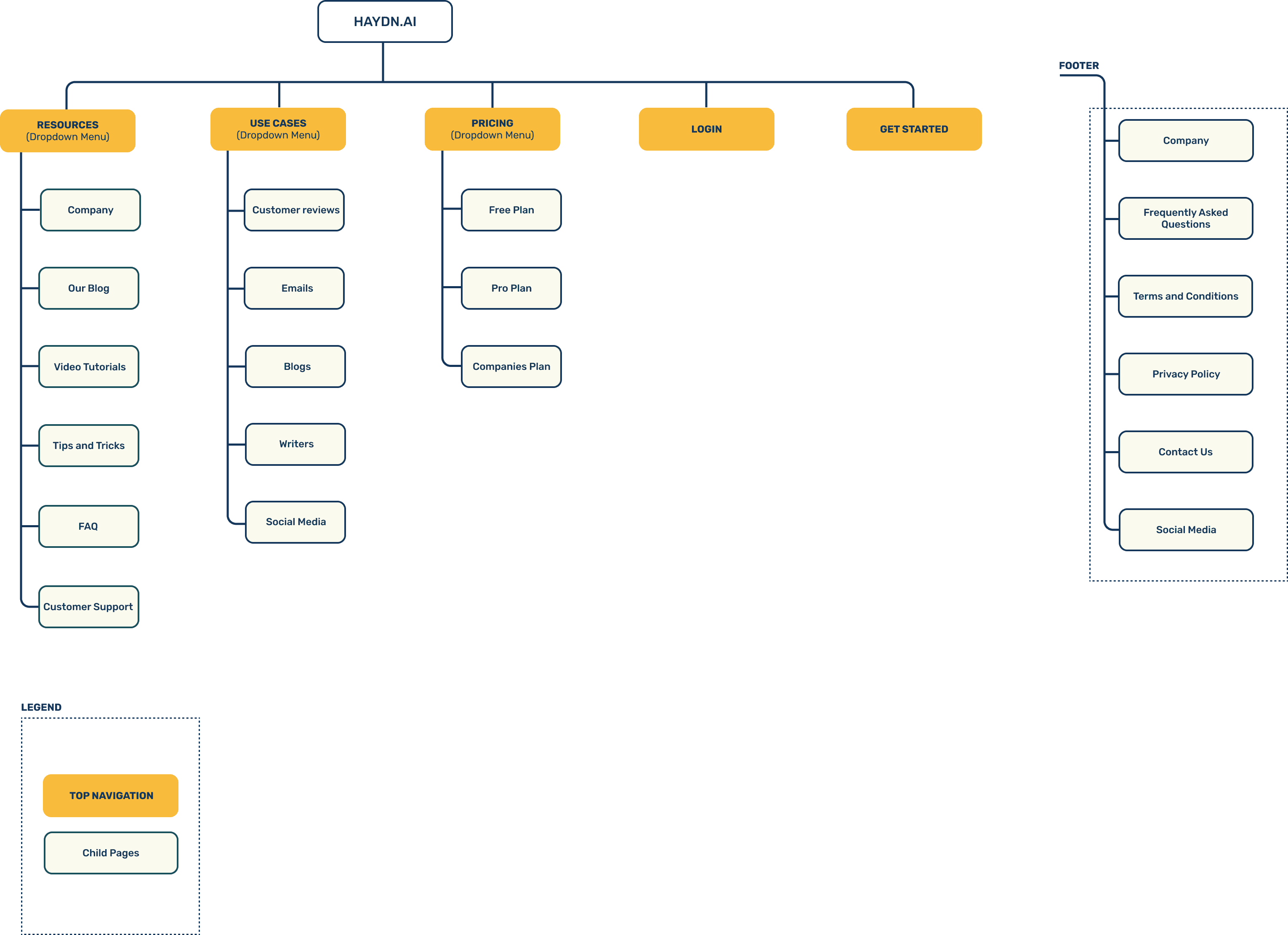
Finalizing The Site Map
This validation gave me the confidence to finalize the Site Map, knowing that it would provide an intuitive experience. By considering the perspectives and preferences of users, I created a navigation that meets their expectations and enhances their overall journey on the website.
Medium-Fidelity Prototype
Armed with a deeper understanding of user needs from Card Sorting activity and insights from the competitive analysis, I proceeded to develop a Medium-Fidelity Landing Page Prototype using a given template as a foundation.
To align with users' expectations for clarity, I opted to maintain a minimalistic design approach. The top navigation bar was organized from left to right, featuring the logo followed by primary categories: Resources, Use Cases, and Pricing.
Additionally, a login button was included for user convenience, along with a prominent CTA button inviting users to "Get Started” with Haydn AI.
LOGO
Resources
Use Cases
Pricing
Login
Get Started
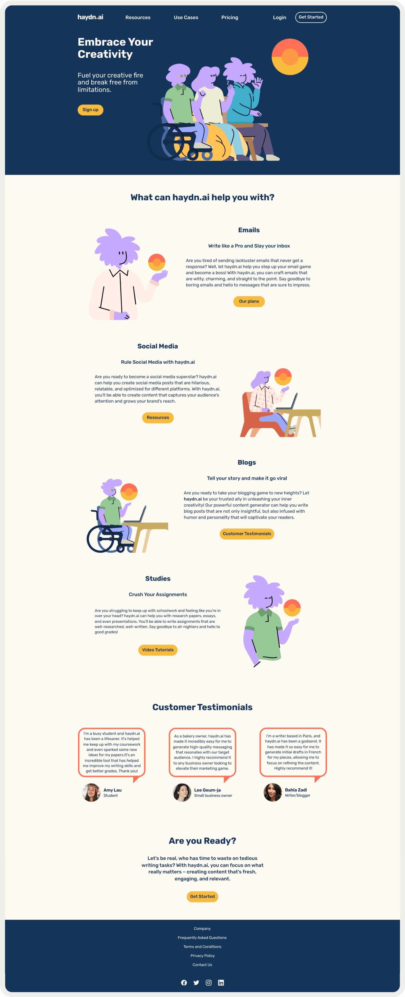
To effectively showcase the content on the landing page, I made the decision to emphasize four key use cases, customer testimonials, and the footer section.
This approach aims to provide visitors with valuable insights into how Haydn.ai can be utilized, instill trust through customer feedback, and ensure easy access to important information through the footer.
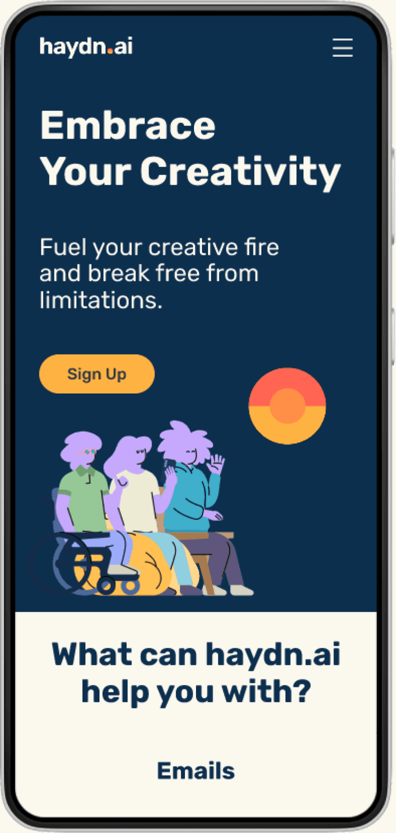
Mobile responsiveness was a key focus as I translated the desktop prototype into a mobile version, ensuring an optimal user experience on smaller screens.
Use Case Example:
What can haydn.ai help you with?
Emails
Write like a Pro and Slay your inbox
Quisque eu finibus urna. Phasellus dolor dolor, sagittis non justo at, iaculis lobortis nunc. Nulla cursus vulputate pellentesque. In efficitur mattis ullamcorper. Vivamus enim est, elementum eu aliquet id, fermentum nec enim. vel, gravida nunc. Morbi varius efficitur nulla. Nula facilisi.
Our plans
Customer testimonials:
Customer Testimonials
Quisque eu finibus urna. Phasellus dolor dolor, sagittis non justo at, iaculis lobortis nunc. Nulla cursus vulputate pellentesque. In efficitur mattis ullamcorper. Vivamus enim est, elementum eu aliquet id, fermentum nec enim.

Customer’s Name
Occupation
Quisque eu finibus urna. Phasellus dolor dolor, sagittis non justo at, iaculis lobortis nunc. Nulla cursus vulputate pellentesque. In efficitur mattis ullamcorper. Vivamus enim est, elementum eu aliquet id, fermentum nec enim.

Customer’s Name
Occupation
Quisque eu finibus urna. Phasellus dolor dolor, sagittis non justo at, iaculis lobortis nunc. Nulla cursus vulputate pellentesque. In efficitur mattis ullamcorper. Vivamus enim est, elementum eu aliquet id, fermentum nec enim.

Customer’s Name
Occupation
DEVELOPING SOLUTIONS
Branding and visual iterations
The client provided us with a comprehensive Style Guidelines, which encompassed the following elements:
Colors
Typography
Iconography
Imagery
Tone & Styling
Components
To ensure alignment with user feedback, I selected the following adjectives to guide our design decisions.
Creative
|
Clear
|
Playful
|
Holistic
Additionally, drawing inspiration from the competitive analysis, I embarked on a logo redesign that prioritized simplicity using the given typeface “Rubik”.
Aa
Aa
Rubik

I chose a stylistic sun symbol as a visual representation of our brand's values, following the trend of sans-serif fonts and logos marks in competitor logos.

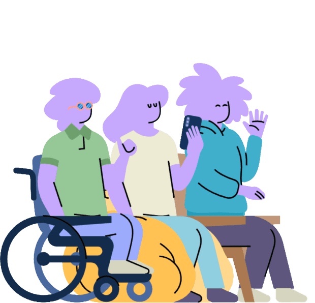
In our marketing materials, I purposefully opted for illustrations over photographs to maintain consistency with the warm color palette provided, effectively reinforcing the branding. By making this deliberate choice, I ensure a cohesive and visually appealing experience that resonates with users’ need for inclusivity.





Hi-fidelity Exploration
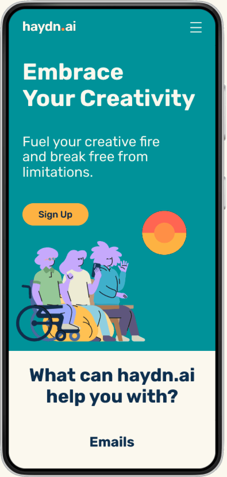
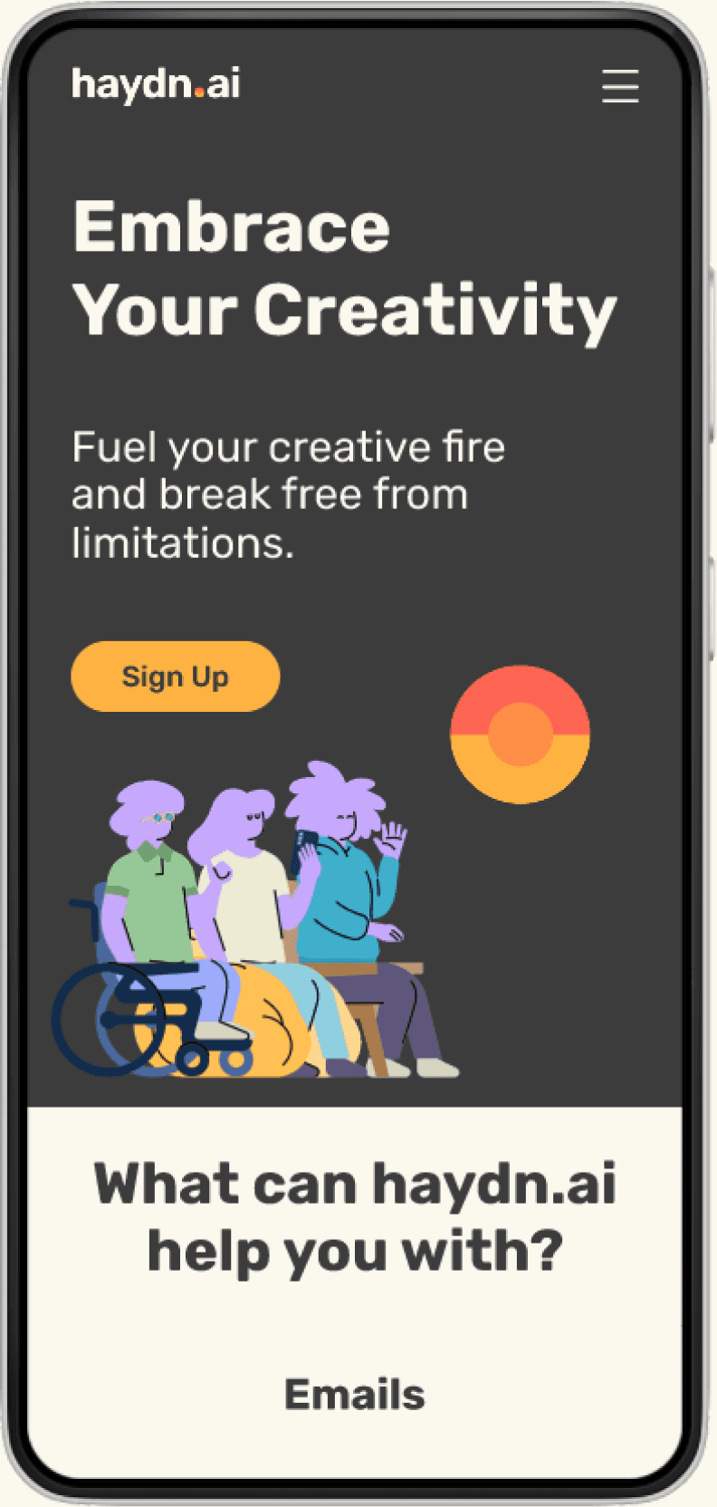
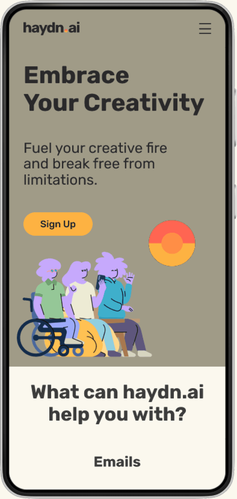
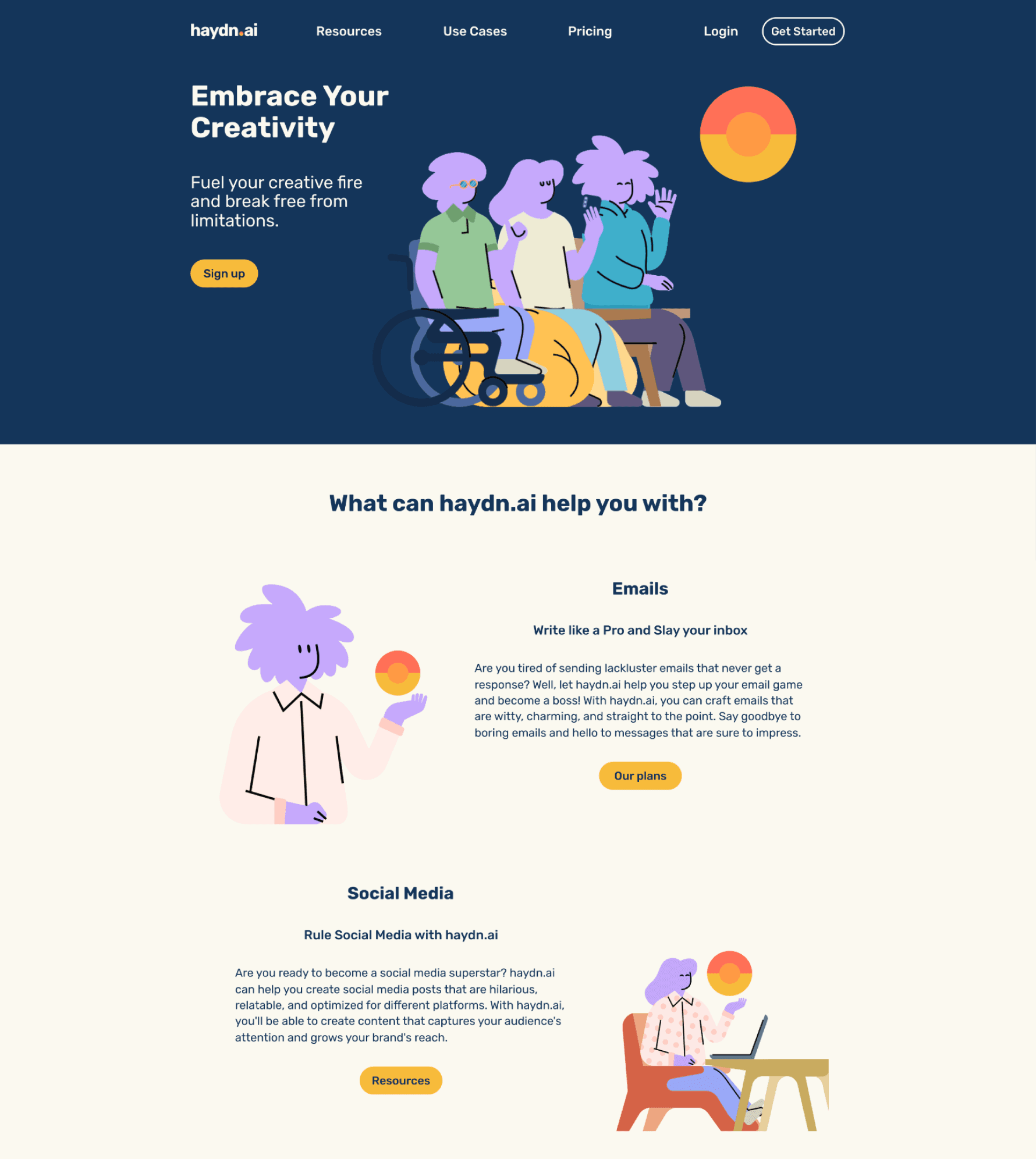
I adopted a mobile-first approach and expanded the design to tablet and desktop screens, experimented with color in hi-fidelity, and received feedback from colleagues to finalize the color palette.
delivering SOLUTIONS
As I ventured even more into the UI Design phase, I was thrilled to infuse colors into my mid-fi prototypes using the 60-30-10 rule.
After experimenting with colors I opted for an "Ivory" dominant color, complemented by the secondary color "10pm Twilight" dark blue, and the accent color "SunFlower Gold," I aimed to bring elegance, professionalism, and vibrancy to the prototype bringing them to life through micro-interactions.

To guide attention and establish visual order, I applied the design principles of Contrast, Alignment, Proximity, and Common Region, ensuring a cohesive and engaging user experience.
Contrast
Proximity
Alignment
Common Region
The Desktop High-Fidelity Landing Page
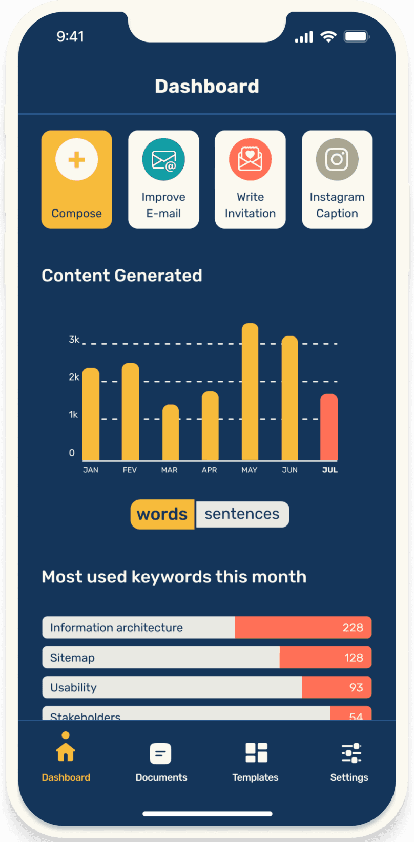
The Mobile Application
Wireframing brings me a sense of excitement as it allows for creative ideation and exploration, providing a tangible representation of the user experience.
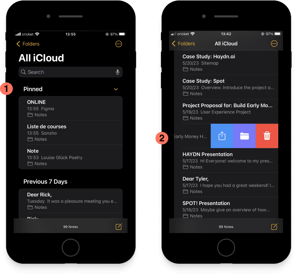
Inspired by the Pinned feature found in App “Notes” on iOS, I incorporated similar functionality into the final product. I then embraced the client's vision and utilized the provided wireframe as a foundation.
App “Notes” on iOS was an inspiration for:
Pinned Feature
Swiped Menu
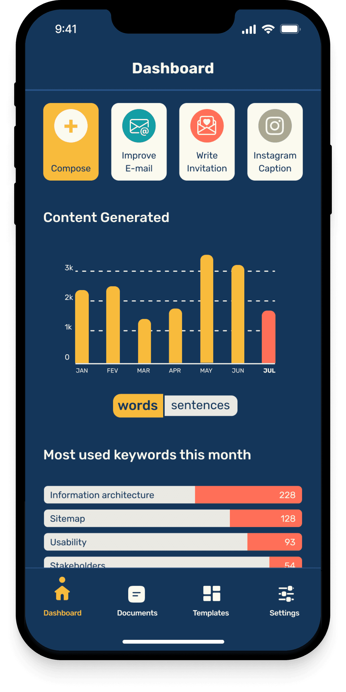
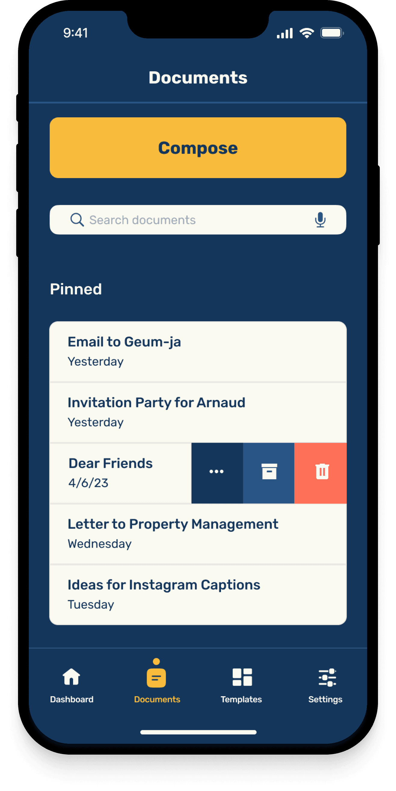
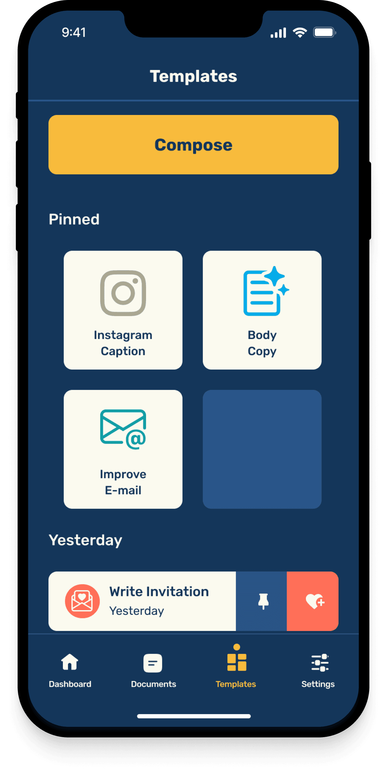
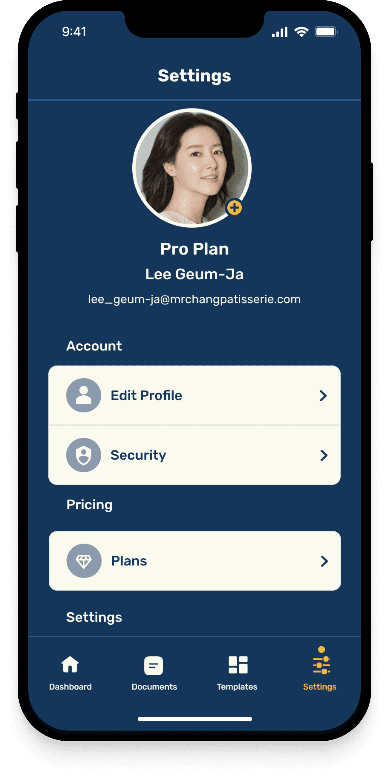
Following the principles of Apple's Human Interface Guidelines, I crafted the final prototype.
HIFI PROTOTYPE
Conclusion
In conclusion, this project has been an incredible experience for me as a designer. It has allowed me to dive deep into research, collaborate with users, and create meaningful deliverables that address their needs.
The iterative process, incorporating feedback and industry best practices, has been truly fulfilling. I'm excited to continue growing and applying these valuable insights in my future projects.



Empowering People to Create Written Content
Project Overview
The project involved conducting competitive analysis, developing a sitemap, running usability testing sessions, and delivering high-fidelity design prototypes. My aim was to meet the specific request of designing a responsive marketing landing page and a mobile application prototype for the Haydn AI content generator platform, ensuring ease of use and effectiveness for users.
My Role: Research Designer, UX and UI Designer
Duration: 3 weeks
Tools: Figma, Google Forms, Optimal Sort, Zoom, Photoshop
Platform: Desktop,
IOS Mobile App
The Design Process
Discover:
Competitive Analysis
Define:
Initial Site Map
Open Card Sort
Finalized Site Map
Develop
Mid-Fidelity Prototype
Deliver:
Style Guide
High-Fidelity Prototype
DISCOVERING and defining the Problem Space
The Competitive Landscape:
In the Haydn project, I embarked on a discovery journey through competitive analysis of 3 competitors in the AI content generator space. My goal was to evaluate their information architecture and visual design.


It is exhilarating to me to gather information and by examining the competitors' marketing websites, I assessed how they organized their content, prioritized information, and guided users through the site. I also evaluated their visual design choices, such as typography, color schemes, and imagery, to understand their branding and user engagement strategies.
Key Insights:
Competitors utilized a minimalistic layout.
Content presented by competitors was wordy.
Top navigation menus contained up to eight items.
Competitors prioritized clean and legible typefaces for their Logos.
Our Users and Their Mental Models:
According to primary research I drafted a Site Map and to test the website efficiency, I conducted an Open Card sort usability test using Optimalworkshop.com. This test helped me understand how people organize and categorize information and what they expect when interacting with the platform.
I then invited a diverse group of potential users from around the world, including academics, business professionals, students, bloggers, and individuals interested in improving their writing and communication skills.
The results of the Open Card Sort activity, along with the additional questionnaire, provided me with valuable insights. I learned that simplicity is key, with participants expressing a preference for clear and concise labeling.
“I expect the information to be presented clearly and in a way that is easy to understand. Clarity is important for me to quickly grasp the content and navigate through the site”


Key Insights:
Consideration for simplicity and clarity.
Importance of concise labeling.
The Open Card sort proved to be an invaluable tool, validating my decisions and adding a human touch to the design process. It provided valuable insights into the mental models and navigation preferences of our target users, ensuring that the information architecture aligns seamlessly with their thought processes.
The power of real human interaction in this process cannot be understated, as it brings warmth and authenticity to the design making this part of the process exciting.
Finalizing The Site Map
This validation gave me the confidence to finalize the Site Map, knowing that it would provide an intuitive experience. By considering the perspectives and preferences of users, I created a navigation that meets their expectations and enhances their overall journey on the website.


Medium-Fidelity Prototype
Armed with a deeper understanding of user needs from Card Sorting activity and insights from the competitive analysis, I proceeded to develop a Medium-Fidelity Landing Page Prototype using a given template as a foundation.
To align with users' expectations for clarity, I opted to maintain a minimalistic design approach. The top navigation bar was organized from left to right, featuring the logo followed by primary categories: Resources, Use Cases, and Pricing.
Additionally, a login button was included for user convenience, along with a prominent CTA button inviting users to "Get Started” with Haydn AI.
LOGO
Resources
Use Cases
Pricing
Login
Get Started
To effectively showcase the content on the landing page, I made the decision to emphasize four key use cases, customer testimonials, and the footer section.
This approach aims to provide visitors with valuable insights into how Haydn.ai can be utilized, instill trust through customer feedback, and ensure easy access to important information through the footer.
Mobile responsiveness was a key focus as I translated the desktop prototype into a mobile version, ensuring an optimal user experience on smaller screens.
Use Case Example:
What can haydn.ai help you with?
Emails
Write like a Pro and Slay your inbox
Quisque eu finibus urna. Phasellus dolor dolor, sagittis non justo at, iaculis lobortis nunc. Nulla cursus vulputate pellentesque. In efficitur mattis ullamcorper. Vivamus enim est, elementum eu aliquet id, fermentum nec enim. vel, gravida nunc. Morbi varius efficitur nulla. Nula facilisi.
Our plans
Customer testimonials:
Customer Testimonials
Quisque eu finibus urna. Phasellus dolor dolor, sagittis non justo at, iaculis lobortis nunc. Nulla cursus vulputate pellentesque. In efficitur mattis ullamcorper. Vivamus enim est, elementum eu aliquet id, fermentum nec enim.


Customer’s Name
Occupation
Quisque eu finibus urna. Phasellus dolor dolor, sagittis non justo at, iaculis lobortis nunc. Nulla cursus vulputate pellentesque. In efficitur mattis ullamcorper. Vivamus enim est, elementum eu aliquet id, fermentum nec enim.


Customer’s Name
Occupation
Quisque eu finibus urna. Phasellus dolor dolor, sagittis non justo at, iaculis lobortis nunc. Nulla cursus vulputate pellentesque. In efficitur mattis ullamcorper. Vivamus enim est, elementum eu aliquet id, fermentum nec enim.


Customer’s Name
Occupation
DEVELOPING SOLUTIONS
Branding and visual iterations
The client provided us with a comprehensive Style Guidelines, which encompassed the following elements:
Colors
Typography
Iconography
Imagery
Tone & Styling
Components
To ensure alignment with user feedback, I selected the following adjectives to guide our design decisions.
Creative
|
Clear
|
Playful
|
Holistic
Additionally, drawing inspiration from the competitive analysis, I embarked on a logo redesign that prioritized simplicity using the given typeface “Rubik”.
Aa
Aa
Rubik


I chose a stylistic sun symbol as a visual representation of our brand's values, following the trend of sans-serif fonts and logos marks in competitor logos.


In our marketing materials, I purposefully opted for illustrations over photographs to maintain consistency with the warm color palette provided, effectively reinforcing the branding. By making this deliberate choice, I ensure a cohesive and visually appealing experience that resonates with users’ need for inclusivity.








Hi-fidelity Exploration
I adopted a mobile-first approach and expanded the design to tablet and desktop screens, experimented with color in hi-fidelity, and received feedback from colleagues to finalize the color palette.


delivering SOLUTIONS
As I ventured even more into the UI Design phase, I was thrilled to infuse colors into my mid-fi prototypes using the 60-30-10 rule.
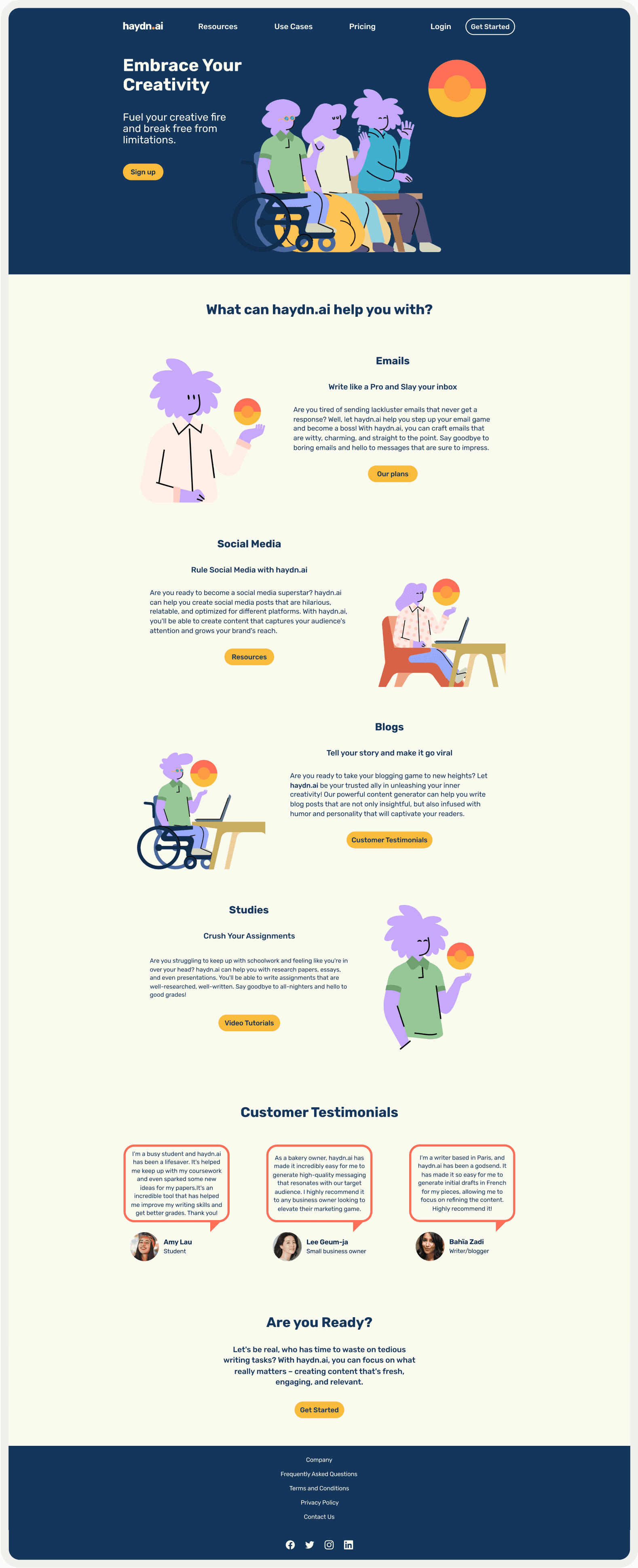
After experimenting with colors I opted for an "Ivory" dominant color, complemented by the secondary color "10pm Twilight" dark blue, and the accent color "SunFlower Gold," I aimed to bring elegance, professionalism, and vibrancy to the prototype bringing them to life through micro-interactions.


To guide attention and establish visual order, I applied the design principles of Contrast, Alignment, Proximity, and Common Region, ensuring a cohesive and engaging user experience.
Contrast
Proximity
Alignment
Common Region
The Desktop High-Fidelity Landing Page

The Mobile Application
Wireframing brings me a sense of excitement as it allows for creative ideation and exploration, providing a tangible representation of the user experience.
Inspired by the Pinned feature found in App “Notes” on iOS, I incorporated similar functionality into the final product. I then embraced the client's vision and utilized the provided wireframe as a foundation.
App “Notes” on iOS was an inspiration for:
Pinned Feature
Swiped Menu


Following the principles of Apple's Human Interface Guidelines, I crafted the final prototype.
HIFI PROTOTYPE


Conclusion
In conclusion, this project has been an incredible experience for me as a designer. It has allowed me to dive deep into research, collaborate with users, and create meaningful deliverables that address their needs.
The iterative process, incorporating feedback and industry best practices, has been truly fulfilling. I'm excited to continue growing and applying these valuable insights in my future projects.


Empowering People to Create Written Content
Project Overview
The project involved conducting competitive analysis, developing a sitemap, running usability testing sessions, and delivering high-fidelity design prototypes. My aim was to meet the specific request of designing a responsive marketing landing page and a mobile application prototype for the Haydn AI content generator platform, ensuring ease of use and effectiveness for users.
My Role: Research Designer, UX and UI Designer
Duration: 3 weeks
Tools: Figma, Google Forms, Optimal Sort, Zoom, Photoshop
Platform: Desktop,
IOS Mobile App
The Design Process
Discover:
Competitive Analysis
Define:
Initial Site Map
Open Card Sort
Finalized Site Map
Develop
Mid-Fidelity Prototype
Deliver:
Style Guide
High-Fidelity Prototype
DISCOVERING
and defining
the Problem Space
The Competitive Landscape:
In the Haydn project, I embarked on a discovery journey through competitive analysis of 3 competitors in the AI content generator space. My goal was to evaluate their information architecture and visual design.



It is exhilarating to me to gather information and by examining the competitors' marketing websites, I assessed how they organized their content, prioritized information, and guided users through the site. I also evaluated their visual design choices, such as typography, color schemes, and imagery, to understand their branding and user engagement strategies.
Key Insights:
Competitors utilized a minimalistic layout.
Content presented by competitors was wordy.
Top navigation menus contained up to eight items.
Competitors prioritized clean and legible typefaces for their Logos.
Our Users and Their Mental Models:
According to primary research I drafted a Site Map and to test the website efficiency, I conducted an Open Card sort usability test using Optimalworkshop.com. This test helped me understand how people organize and categorize information and what they expect when interacting with the platform.
I then invited a diverse group of potential users from around the world, including academics, business professionals, students, bloggers, and individuals interested in improving their writing and communication skills.
The results of the Open Card Sort activity, along with the additional questionnaire, provided me with valuable insights. I learned that simplicity is key, with participants expressing a preference for clear and concise labeling.


“I expect the information to be presented clearly and in a way that is easy to understand. Clarity is important for me to quickly grasp the content and navigate through the site”
Key Insights:
Consideration for simplicity and clarity.
Importance of concise labeling.
The Open Card sort proved to be an invaluable tool, validating my decisions and adding a human touch to the design process. It provided valuable insights into the mental models and navigation preferences of our target users, ensuring that the information architecture aligns seamlessly with their thought processes.
The power of real human interaction in this process cannot be understated, as it brings warmth and authenticity to the design making this part of the process exciting.
Finalizing The Site Map
This validation gave me the confidence to finalize the Site Map, knowing that it would provide an intuitive experience. By considering the perspectives and preferences of users, I created a navigation that meets their expectations and enhances their overall journey on the website.


Medium-Fidelity Prototype
Armed with a deeper understanding of user needs from Card Sorting activity and insights from the competitive analysis, I proceeded to develop a Medium-Fidelity Landing Page Prototype using a given template as a foundation.
To align with users' expectations for clarity, I opted to maintain a minimalistic design approach. The top navigation bar was organized from left to right, featuring the logo followed by primary categories: Resources, Use Cases, and Pricing.
Additionally, a login button was included for user convenience, along with a prominent CTA button inviting users to "Get Started” with Haydn AI.
LOGO
Resources
Use Cases
Pricing
Login
Get Started
To effectively showcase the content on the landing page, I made the decision to emphasize four key use cases, customer testimonials, and the footer section.
This approach aims to provide visitors with valuable insights into how Haydn.ai can be utilized, instill trust through customer feedback, and ensure easy access to important information through the footer.
Mobile responsiveness was a key focus as I translated the desktop prototype into a mobile version, ensuring an optimal user experience on smaller screens.
Use Case Example:
What can haydn.ai help you with?
Emails
Write like a Pro and Slay your inbox
Quisque eu finibus urna. Phasellus dolor dolor, sagittis non justo at, iaculis lobortis nunc. Nulla cursus vulputate pellentesque. In efficitur mattis ullamcorper. Vivamus enim est, elementum eu aliquet id, fermentum nec enim. vel, gravida nunc. Morbi varius efficitur nulla. Nula facilisi.
Our plans
Customer testimonials:
Customer Testimonials
Quisque eu finibus urna. Phasellus dolor dolor, sagittis non justo at, iaculis lobortis nunc. Nulla cursus vulputate pellentesque. In efficitur mattis ullamcorper. Vivamus enim est, elementum eu aliquet id, fermentum nec enim.


Customer’s Name
Occupation
DEVELOPING SOLUTIONS
Branding and visual iterations
The client provided us with a comprehensive Style Guidelines, which encompassed the following elements:
Colors
Typography
Iconography
Imagery
Tone & Styling
Components
To ensure alignment with user feedback, I selected the following adjectives to guide our design decisions.
Creative
Clear
Playful
Holistic
Additionally, drawing inspiration from the competitive analysis, I embarked on a logo redesign that prioritized simplicity using the given typeface “Rubik”.
Aa
Aa
Rubik


I chose a stylistic sun symbol as a visual representation of our brand's values, following the trend of sans-serif fonts and logos marks in competitor logos.


In our marketing materials, I purposefully opted for illustrations over photographs to maintain consistency with the warm color palette provided, effectively reinforcing the branding. By making this deliberate choice, I ensure a cohesive and visually appealing experience that resonates with users’ need for inclusivity.


Hi-fidelity Exploration
I adopted a mobile-first approach and expanded the design to tablet and desktop screens, experimented with color in hi-fidelity, and received feedback from colleagues to finalize the color palette.


delivering SOLUTIONS
As I ventured even more into the UI Design phase, I was thrilled to infuse colors into my mid-fi prototypes using the 60-30-10 rule.
After experimenting with colors I opted for an "Ivory" dominant color, complemented by the secondary color "10pm Twilight" dark blue, and the accent color "SunFlower Gold," I aimed to bring elegance, professionalism, and vibrancy to the prototype bringing them to life through micro-interactions.


To guide attention and establish visual order, I applied the design principles of Contrast, Alignment, Proximity, and Common Region, ensuring a cohesive and engaging user experience.
Contrast
Proximity
Alignment
Common Region
The Desktop High-Fidelity Landing Page


The Mobile Application
Wireframing brings me a sense of excitement as it allows for creative ideation and exploration, providing a tangible representation of the user experience.
Inspired by the Pinned feature found in App “Notes” on iOS, I incorporated similar functionality into the final product. I then embraced the client's vision and utilized the provided wireframe as a foundation.
App “Notes” on iOS was an inspiration for:
Pinned Feature
Swiped Menu


Following the principles of Apple's Human Interface Guidelines, I crafted the final prototype.
HIFI PROTOTYPE


Conclusion
In conclusion, this project has been an incredible experience for me as a designer. It has allowed me to dive deep into research, collaborate with users, and create meaningful deliverables that address their needs.
The iterative process, incorporating feedback and industry best practices, has been truly fulfilling. I'm excited to continue growing and applying these valuable insights in my future projects.