

Rebranding and Responsive Website
Project Overview
This project focused on the complete rebranding of Dr. Laura Lee Larson’s practice.
The rebranding included the creation of a new logo, website, social media visual presence, and business card, all designed to reflect her mission of cultivating emotionally intelligent and engaged leaders.
My Role: Research Designer, UX and UI Designer, Graphic Designer
Duration: 6 months
Tools: Figma, Photoshop, Trello, Zoom
Platform: Responsive desktop and mobile website, Prints
About Dr. Laura Lee Larson:
Dr. Laura Lee Larson is a seasoned expert in leadership and organizational development. With over 20 years of experience spanning Consumer Packaged Goods (CPG) Sales, Category Management Leadership, Training, and Coaching. Her practice focuses on cultivating emotionally intelligent leaders and cohesive teams by fostering engaged cultures, growth mindsets, and diversity within organizations.
My Role:
Brand Strategist: Collaborated with Dr. Larson to understand her vision and goals, translating them into a cohesive visual identity that reflects her expertise in emotional intelligence and leadership development. Clear communication and a sense of camaraderie were key in facilitating a harmonious exchange of ideas throughout the process.
User and Competitive Researcher: Conducted user and competitive research to understand Dr. Larson’s target audience and position her brand distinctly within the leadership and organizational development landscape. This research ensured that the design resonated with her clients and stood out in the market.
Graphic Designer: Created a minimalist, geometric logo featuring the Plus sign to symbolize unity, collaboration, and the value Dr. Larson brings to organizations, aligning with her focus on creating harmony within teams.
Web Designer: Designed an accessible, user-friendly website adhering to WCAG AA guidelines, ensuring inclusivity for all users. The website highlights Dr. Larson’s services and approach, fully aligned with her new brand identity and fostering a sense of connection with her audience.
Photographer: Captured professional photos that enhance Dr. Larson’s online and print materials, ensuring visual consistency across her brand and helping her connect with her audience on a personal level.
Conceptual Foundation:
The design is inspired by the vibrant color palette of Lumina Spark, a tool Laura Lee incorporates in her seminars, blended with a minimalist, geometric style. This deliberate choice reflects the precision of Dr. Larson’s work, resulting in a clean yet impactful visual representation.
The Logo:
At the heart of the design is the Plus sign, a symbol rich in meaning. It reflects the exceptional value Dr. Larson provides by fostering harmonious relationships within teams. The shape also evokes a cross, suggesting the crossroads where different team members meet and align under her guidance, reinforcing the themes of inclusivity and unity.

Core Colors:

Black #252525

Blue #3571B9

Green #04973E

yellow #FCB929

RED #C0041C
Brand Adjectives:
Holistic
Transformative
Inclusive
Impactful
Collaborative
Empowering
typography:
To further enhance the brand’s longevity and modernity, I selected Futura, an iconic typeface from the 1920s. With its clean lines and geometric form, Futura ensures clarity while evoking the timeless elegance and functionality of early modernist design. This choice aligns seamlessly with Dr. Larson’s vision and resonates with contemporary design trends.
FUTURA BOLD
|
FUTURA CONDENSED MEDIUM
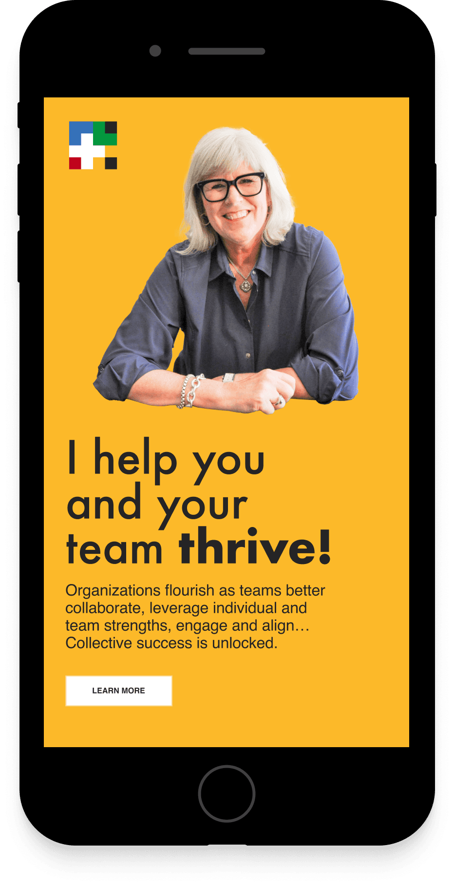
the Landing Page:

Social Media:

Business Cards:

takeways:
The rebranding project for Dr. Laura Lee Larson successfully established a cohesive visual identity that reflects her expertise in leadership and emotional intelligence. The new logo, website, social media visuals, and business cards create a consistent presence across platforms, effectively communicating her mission and resonating with her target audience.
The project did present challenges. Conducting user and competitive research was a significant effort, yet it was essential for understanding the problem space and developing a clear strategy.
Additionally, achieving a minimalist design while retaining symbolic depth demanded careful consideration to avoid oversimplification.
Overall, the project successfully created a refined brand that supports Dr. Larson’s mission and distinguishes her in the marketplace.