School searching made easy
Project Overview
The project's main objective was to enhance the online school search experience for parents of K-12 students. My role revolved around conducting extensive research to gain insights into the needs, preferences, and frustrations of parents during the school search process and then develop and deliver those solutions to high-fidelity. Finally I was responsible for defining the visual identity of the product.
My Role: Research Designer, UX and UI Designer
Duration: 3 weeks
Tools: Figma, Google Forms, Photoshop
Platform: IOS Mobile App
The Design Process
Discover:
Domain Research
Competitive Analysis
User Interviews
User Surveys
Define:
Empathy Map
User Flow Diagram
MoSCoW Priority Matrix
Develop
Rapid Sketching
Prototyping
User Testing
Deliver:
Ideation
Style Guide
Hi-Fi Prototype
DISCOVERING the Problem Space
Prior to diving into competitor and user research, I formulated key questions to guide my next steps and provide a clear direction.
Research questions:
What are the common challenges or frustrations parents face during the school search process?
How do parents currently gather information about potential schools for their children?
What features or functionalities would parents find most valuable in a digital tool designed to support the school selection process?
Competitive Research
To learn about the subject matter and the audience, I employed various research methods and techniques.
I started by performing a competitive analysis to evaluate the strengths and weaknesses of our competitors, as well as to determine the trends and best practices among them.
I covered 4 competitors which are: Niche, Chicago Public Schools, Great Schools and Ours Kids.


I conclude that there were many competitors that were successfully solving that problem. I wanted to discover how successful they are and what are the areas of improvements. The two key insights from the SWOT analysis showed that:
All competitors have a filtering and search system to assist users in refining their school options.
2/4 of competitors provided a mobile application.
User Research: Qualitative Data and Quantitative Data
With the research insights and user in mind, my next step involved conducting in-depth qualitative and quantitative research to gain deeper insights about the target audience. I started by analyzing six given qualitative interviews that provided valuable information about users' needs and expectations.
Using these insights, I used an affinity mapping technique to group and synthesize them, facilitating better comprehension.
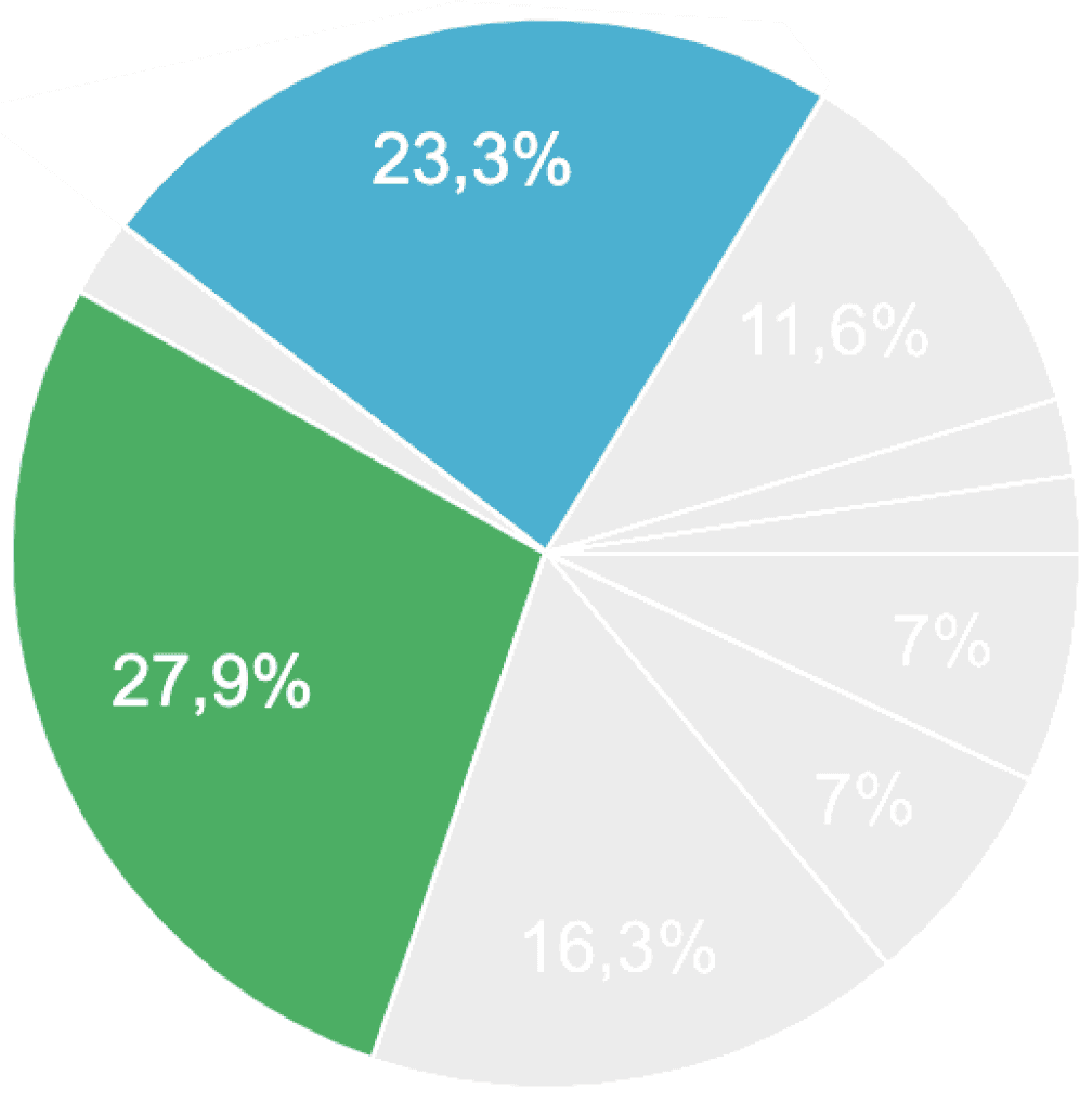
An additional interview was conducted and a quantitative user survey was run collectively to validate insights from a larger sample size. A total of 69 participants.
The survey revealed significant insights:
Need for a comparison tool that can assist in making informed decisions when selecting a school.
Need for a diverse selection of schools
Research Findings:
Based on my initial research, I compiled a list of insights that would serve as the foundation and guide my next design decisions.
Domain/Competitive
Competitors have a filtering and search system
Few competitors offer a mobile platform to solve the problem
2 competitors are offering a multilingual services
Interviews
School search is time-consuming.
Parents focus on schools in their area in the first steps of the research.
They strongly rely on the community to get information and support and use the internet as a complementary tool.
Parents prioritize their child's wellness above all and also strongly value the school's culture.
Survey:
Need for school comparison tool.
Need for a diverse selection of schools
The Importance of conducting an additional Interview:
After carefully analyzing and synthesizing the data from six initial interviews, I realized that there was still a gap in my understanding of the users' experiences:
The significance of empathy in the design process.
To bridge this gap, I recognized the importance of conducting an additional user interview.
The interview allowed me to connect with users on a deeper level and develop a profound empathy for their challenges empowering me to create solutions that truly address their pain points.
Added warmth to the project
Connected on a deeper level with users
Developed profound empathy for their challenges
Empowered to create effective solutions for users' pain points
I synthesized the research and created the following problem statement:
Parents who lead busy lives and are searching for the optimal school for their kids, often encounter obstacles in getting comprehensive information from a single source and comparing schools, which makes the process time-consuming. As a result, they need a tool that specifically addresses these challenges.
defining and DEVELOPING SOLUTIONS
Once I defined the problem statement, it served as my guiding light for future design decisions. To ensure effective use of my time and resources, I prioritized features based on their relevance to solving the problem.
Through the use of a Moscow map, I categorized features for our platform's MVP (Minimum Viable Product) keeping our users at the forefront.
Guided by the problem statement, the significance of a comparison tool led me to envision a data-driven platform for making informed school comparisons.
Rapid Sketching
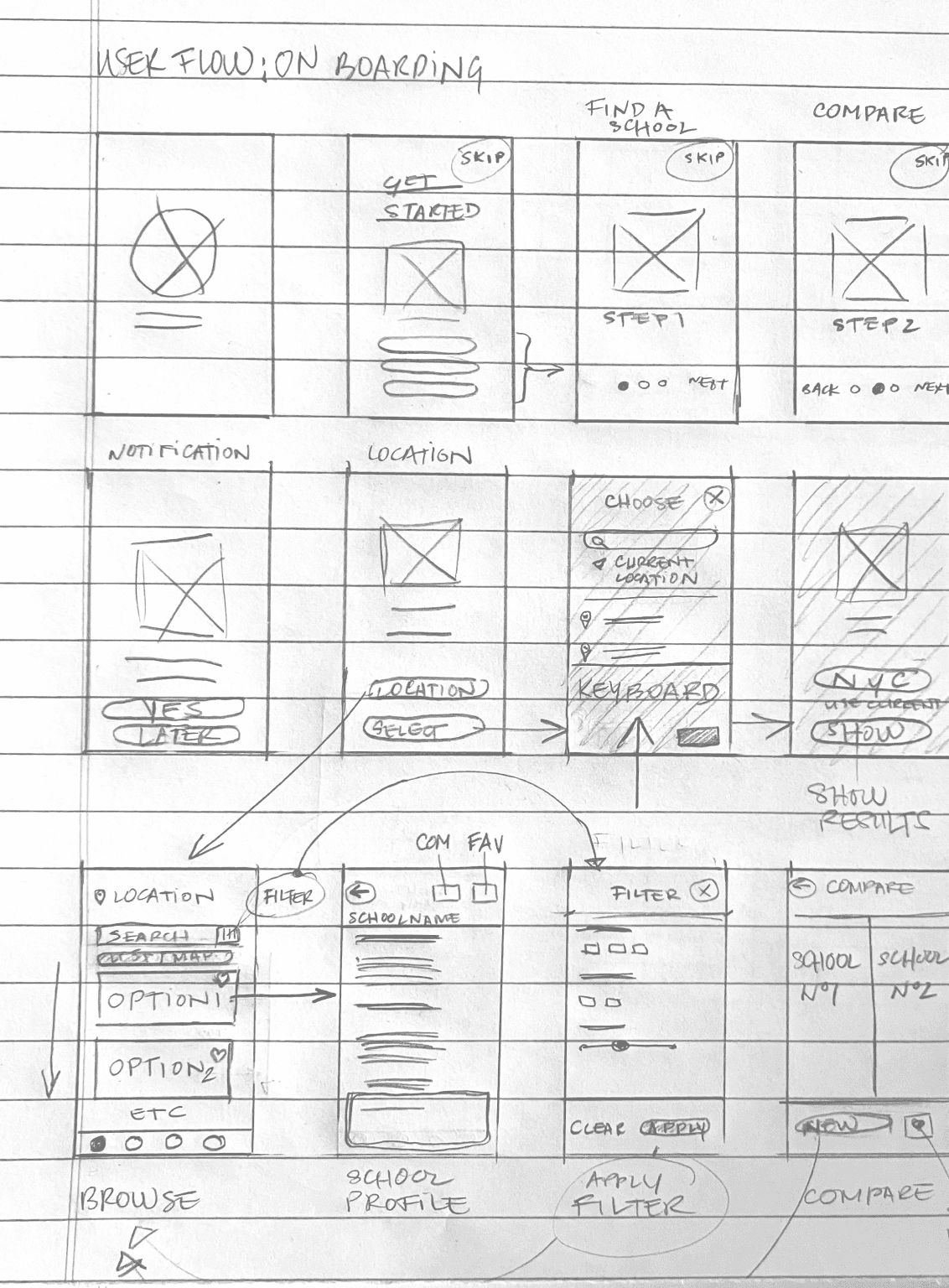
I set out to generate a wide array of ideas and potential solutions, aiming to explore both conventional and unconventional approaches by sketching ideas on paper.
In the end, I arrived at an app concept that offers:
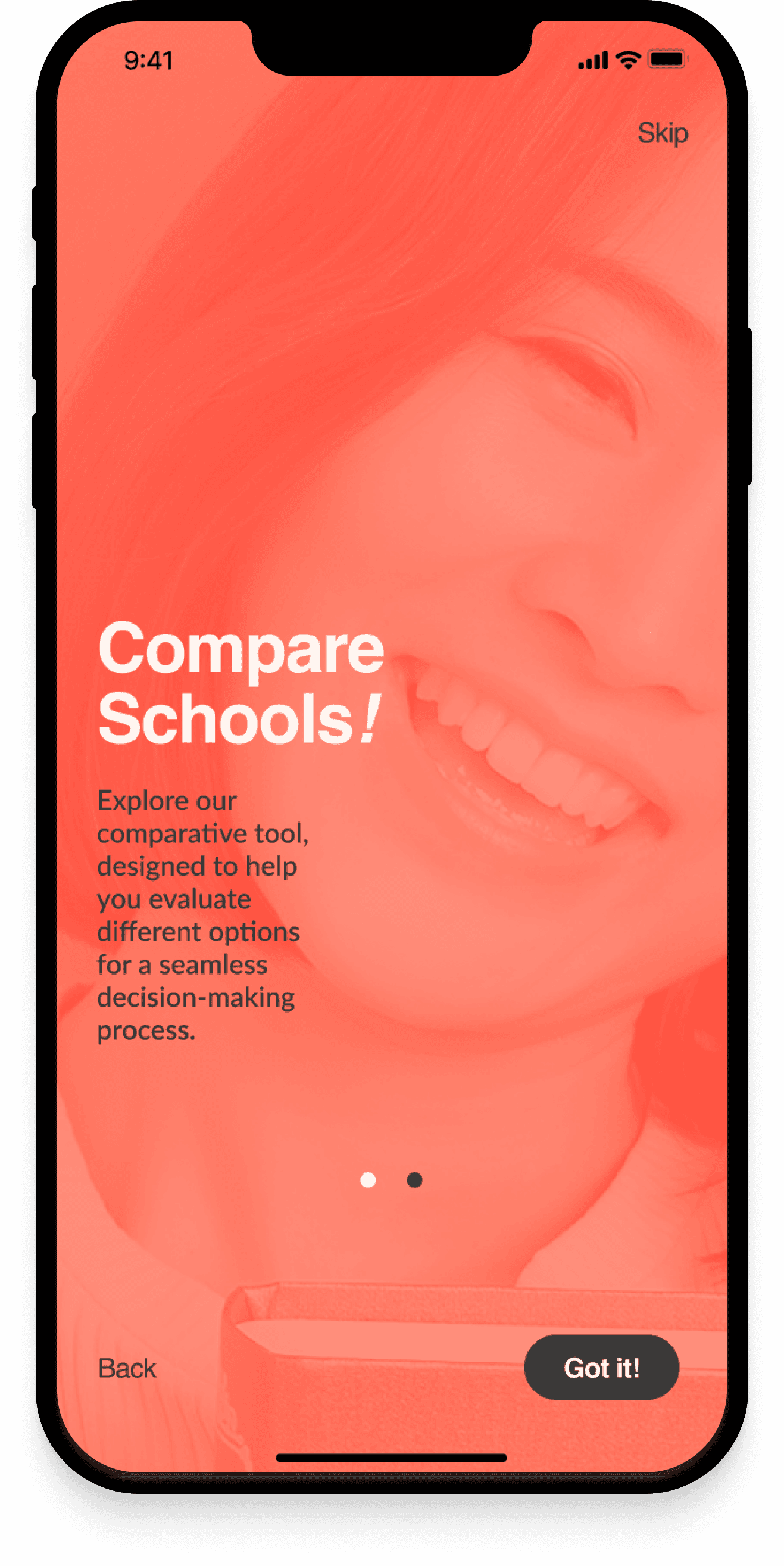
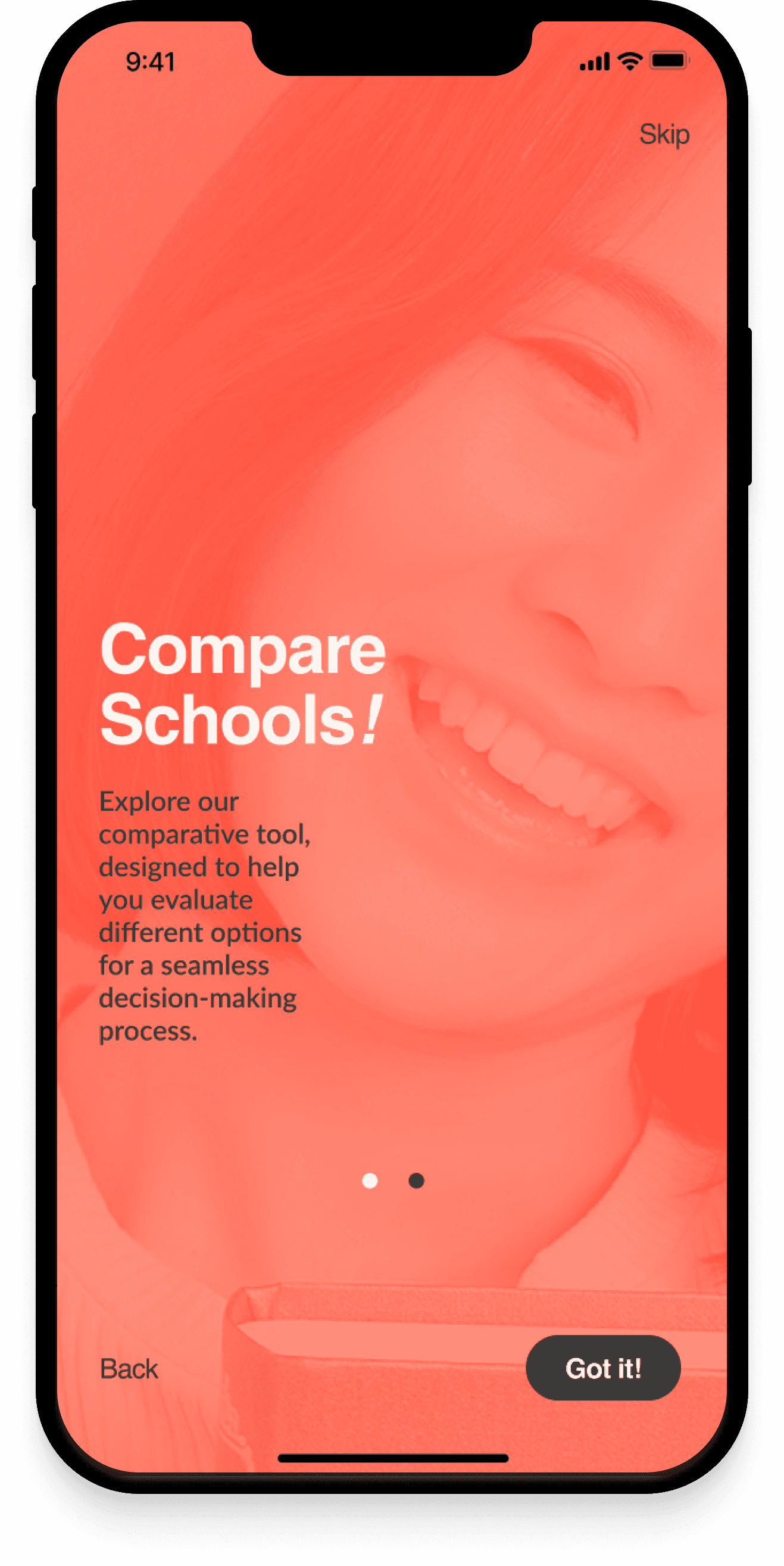
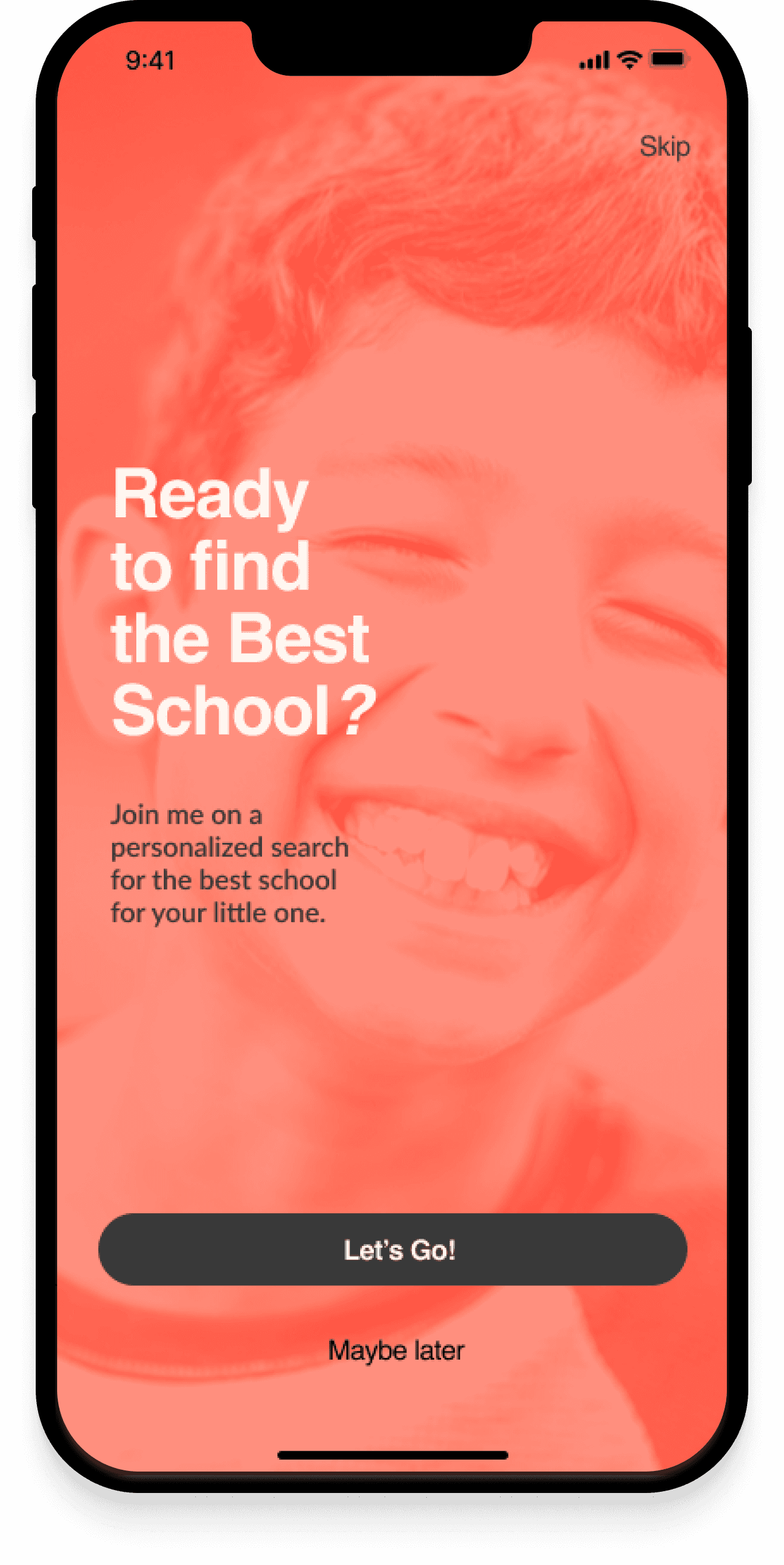
An engaging onboarding experience to introduce users to the app's capabilities.
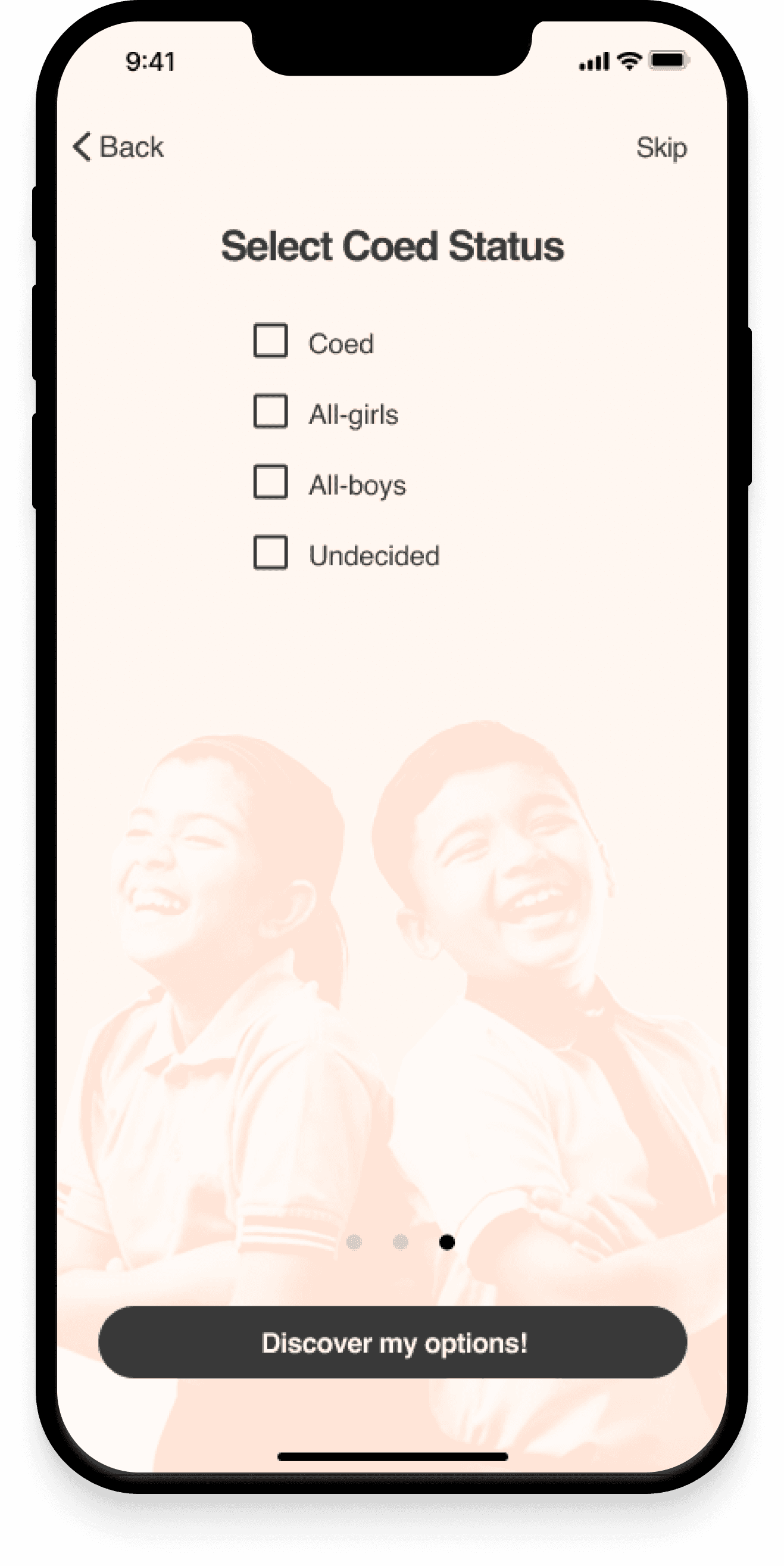
A tailored user experience that helps individuals refine their school choices.
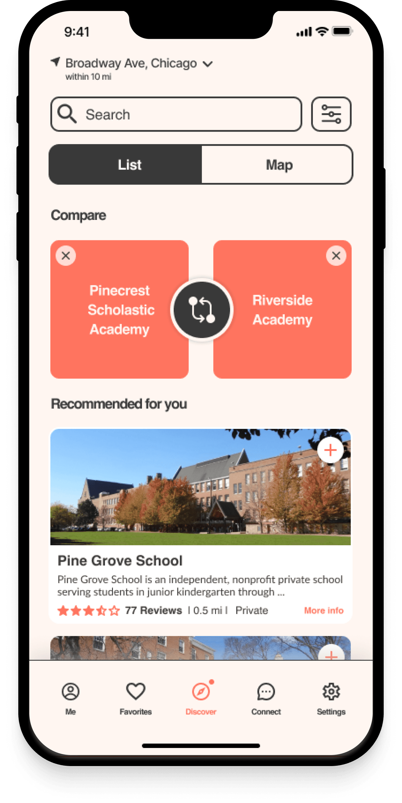
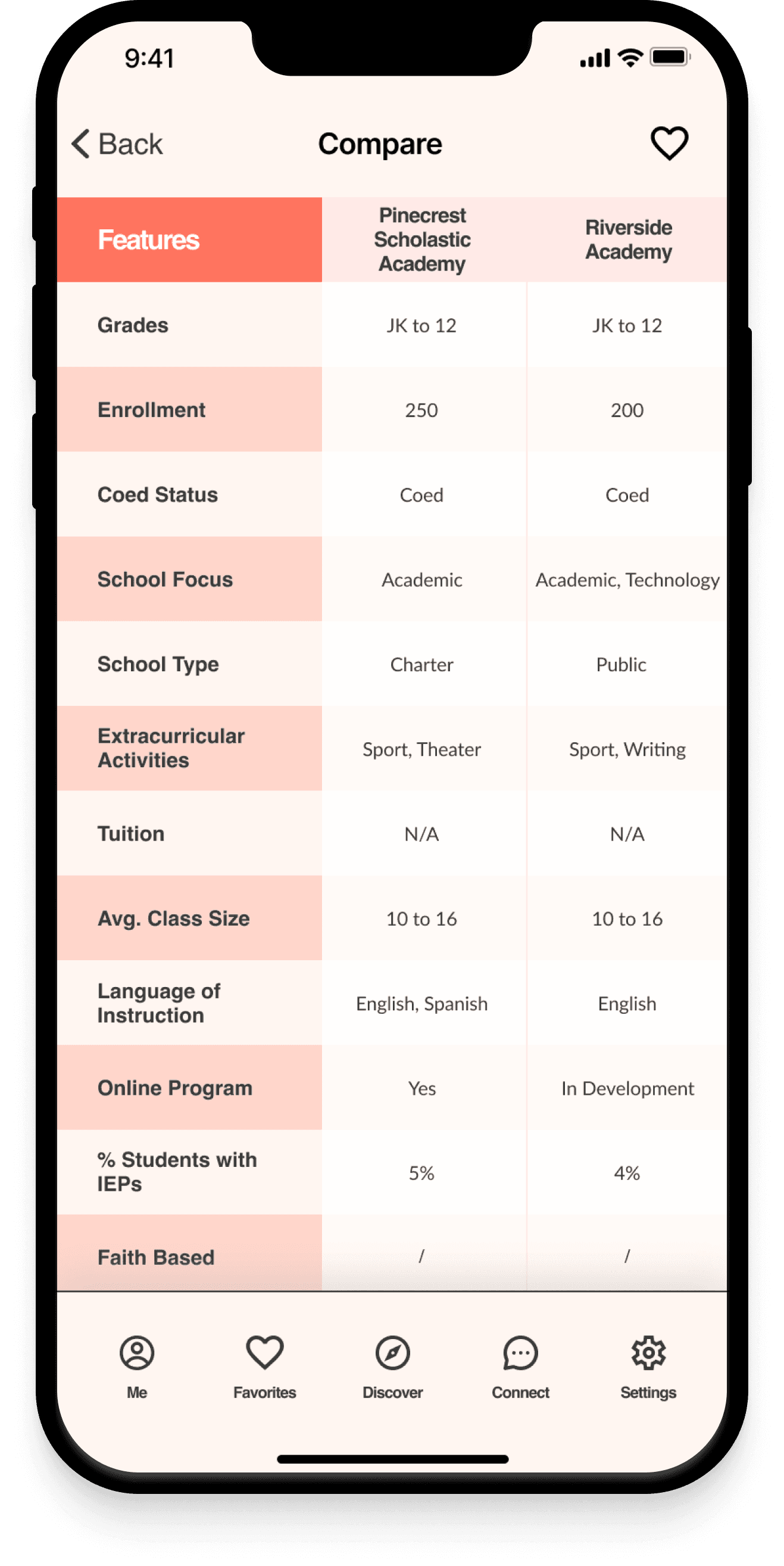
A powerful comparison tool as a core feature.
User Flow Diagram
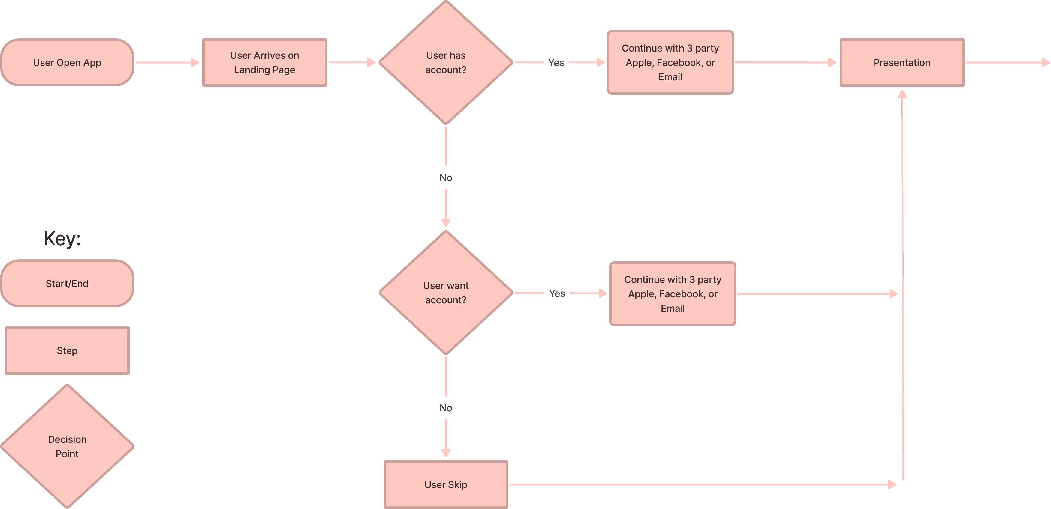
To ensure a smooth and intuitive user experience, I needed to map out the user interactions within our product before diving into the detailed wire-framing and prototyping.
By creating a user task flow diagram, I visualized the optimal path users would take from the beginning to the end of their journey. This diagram helped me identify potential pain points or decision-making moments that could impact the user experience.
As part of my design strategy, I introduced a "Skip button” feature, allowing users to bypass the onboarding and presentation steps, as well as the personalized experience, if they desired. This streamlined access to the core features of the app and catered to users who preferred a quicker route to their desired outcomes.
Next, I transitioned to a mid-fidelity prototype, a more concrete embodiment of the design. This prototype included essential components and interactions to guide users through the defined user tasks. By identifying and addressing usability issues at this stage, I aimed to avoid time-consuming changes in later design phases.
Learnings from User Testing
As a passionate designer, interacting with users and gathering live feedback brings the project to life. I conducted user testing with three parents to assess the usability and functionality of the prototype. The user testing process was really enjoyable, and it provided unexpected insights that greatly influenced my design decisions.
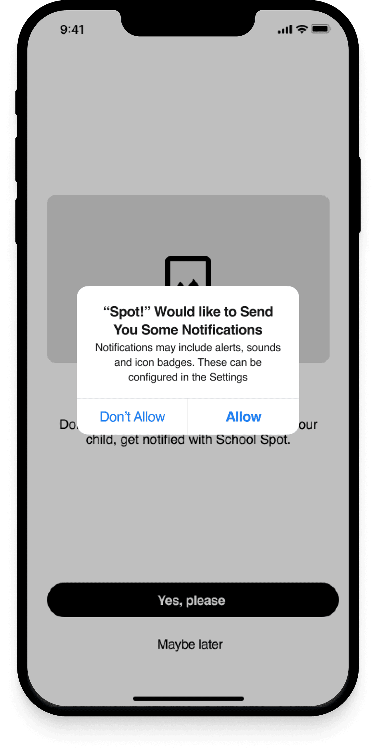
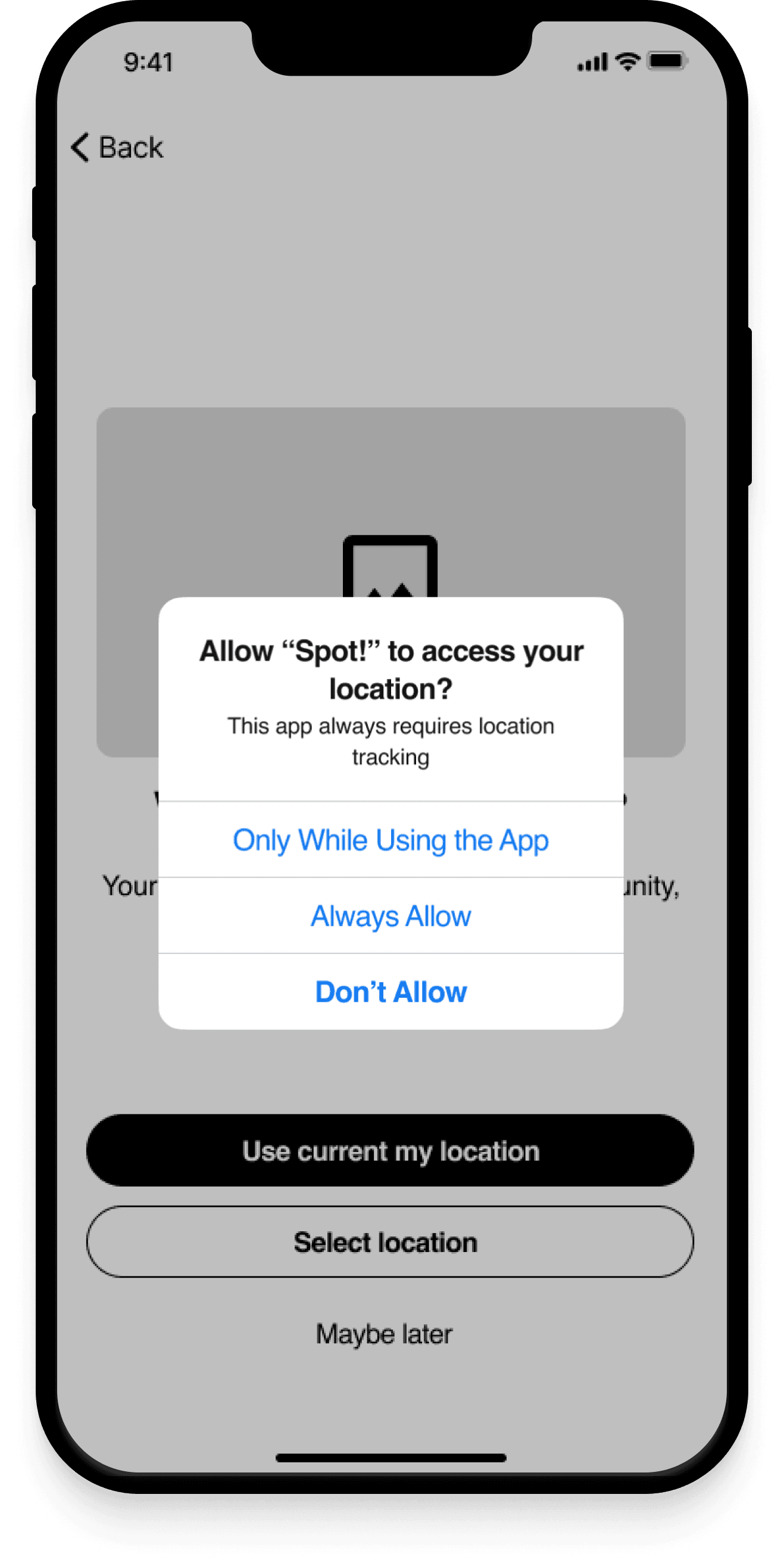
Notifications/location screens: 2/3 of users opted not to activate notifications but shared their location with the "Only While Using the App" option.
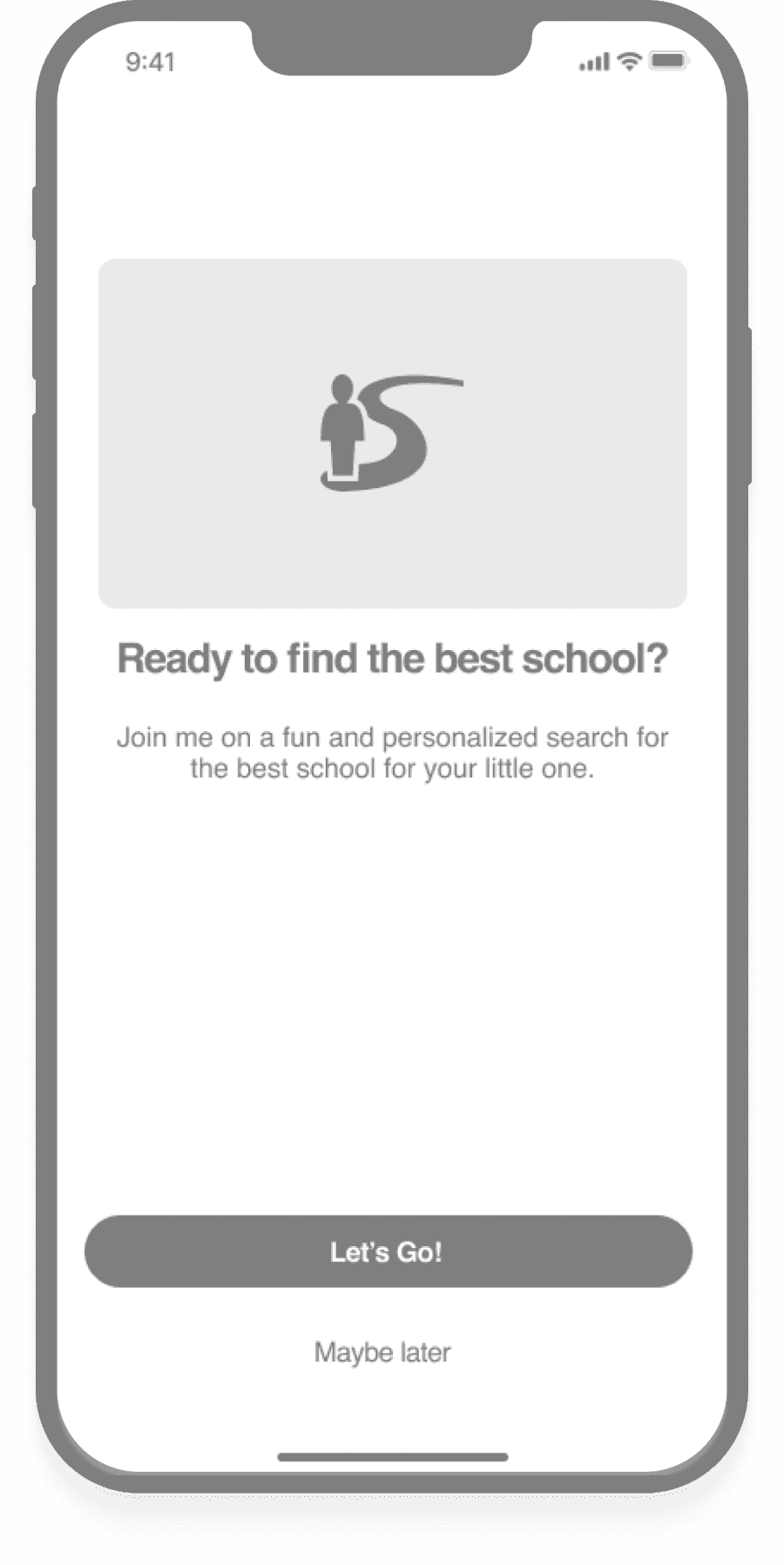
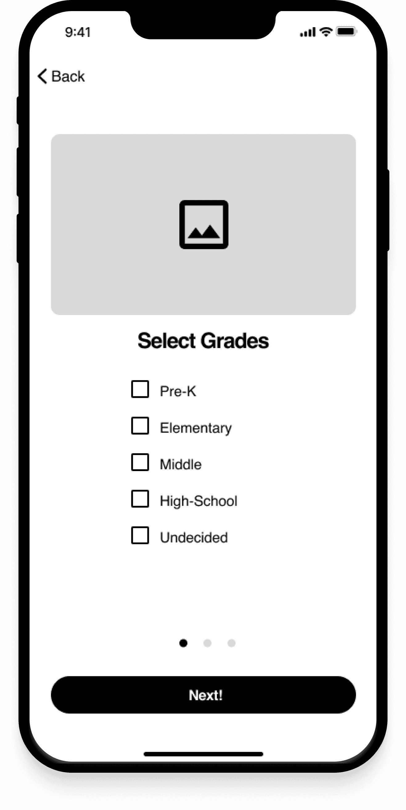
Personalized Experience: Users consistently clicked on the name instead of ticking the box to make their selection, leading to confusion.
Discover Screen:
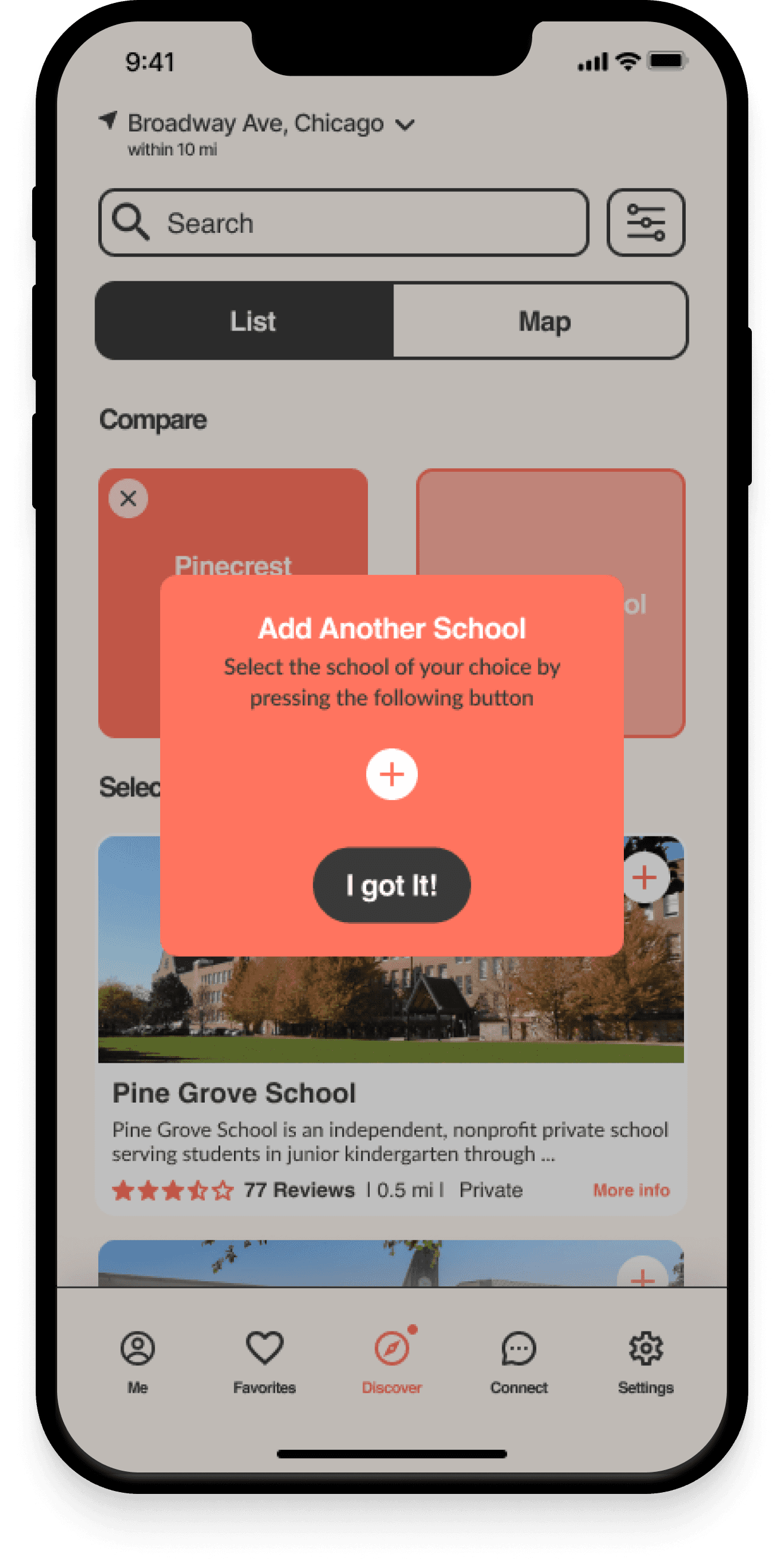
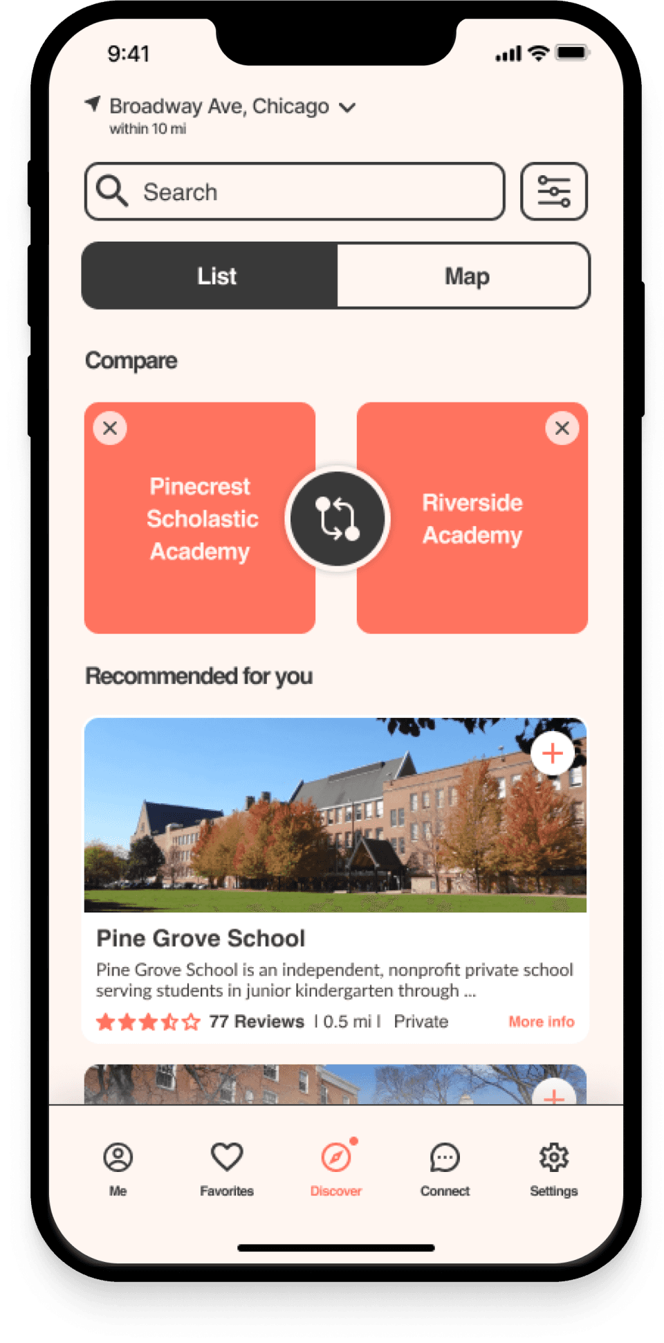
Only one user noticed the popup signifier call-to-action (CTA) for the Share button on the Discover page.
2/3 of the users accessed the Compare page using the comparison button located on the bottom menu.
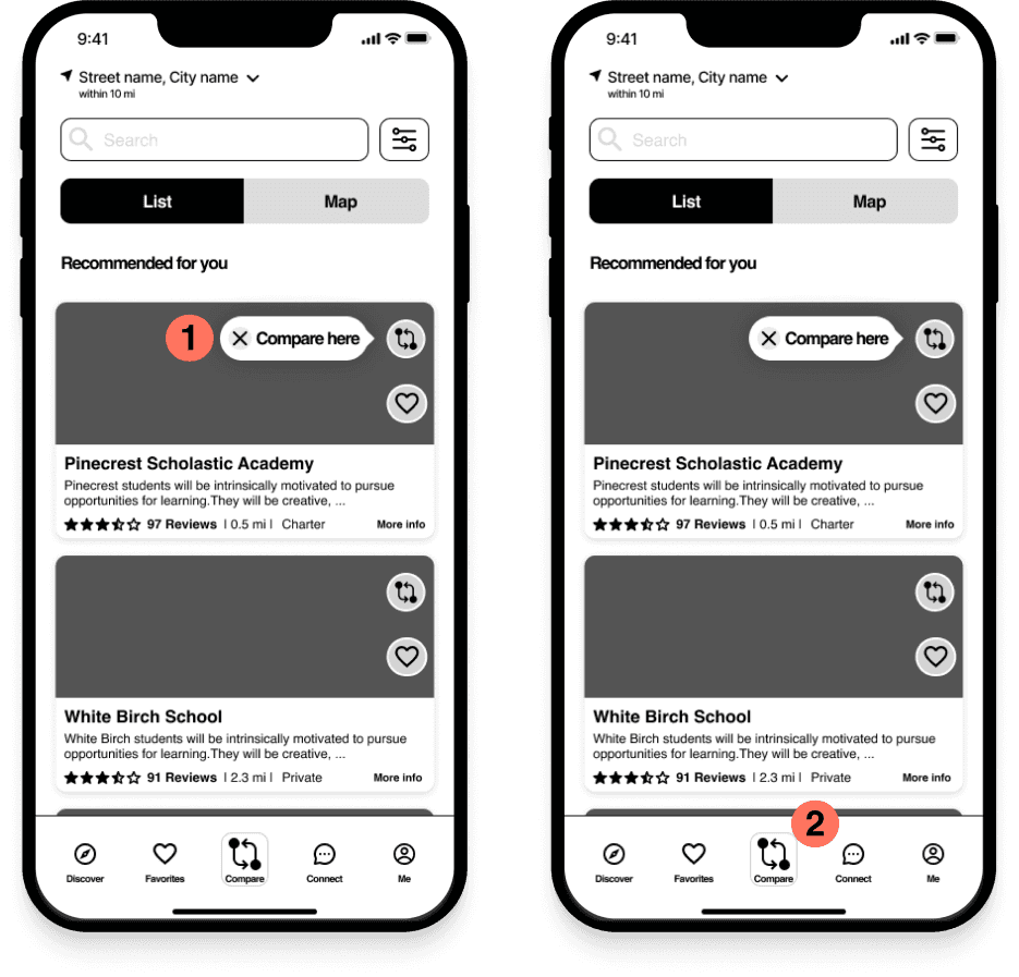
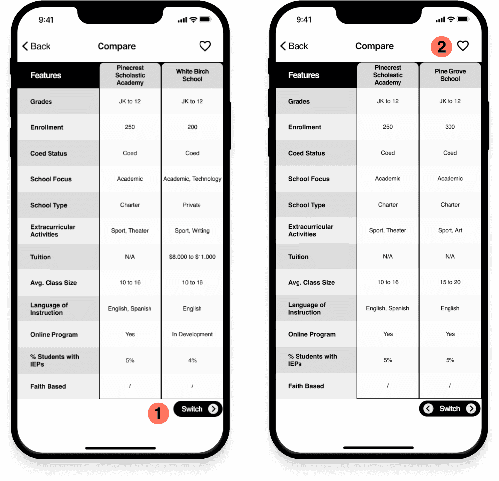
Comparison Screen:
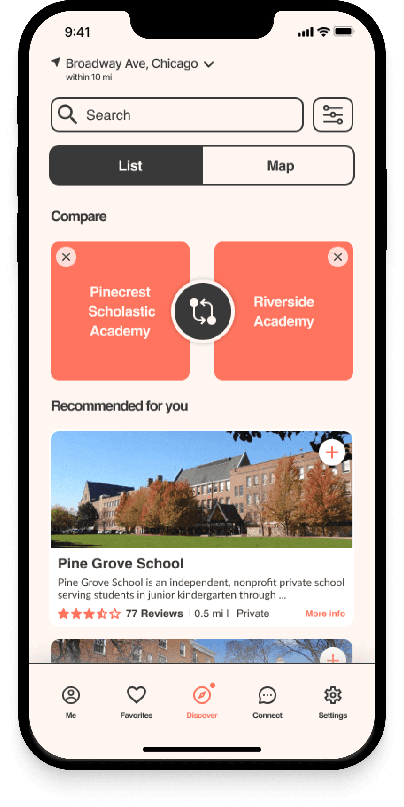
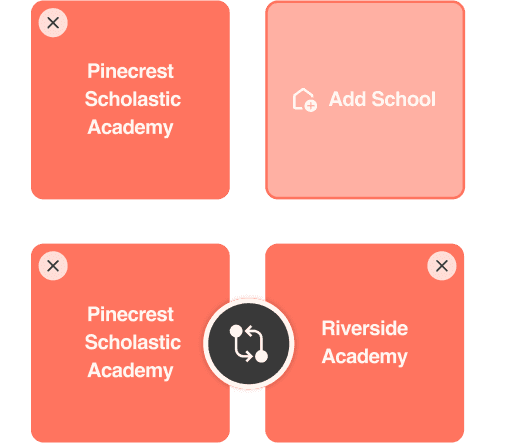
Interaction with the comparison tool using the CTA “Switch” on the bottom left allowed users to switch panels
Users could save favorites successfully.
Solutions from testing
To maintain a seamless user experience, I moved notification, location and language settings to the end of the onboarding process.
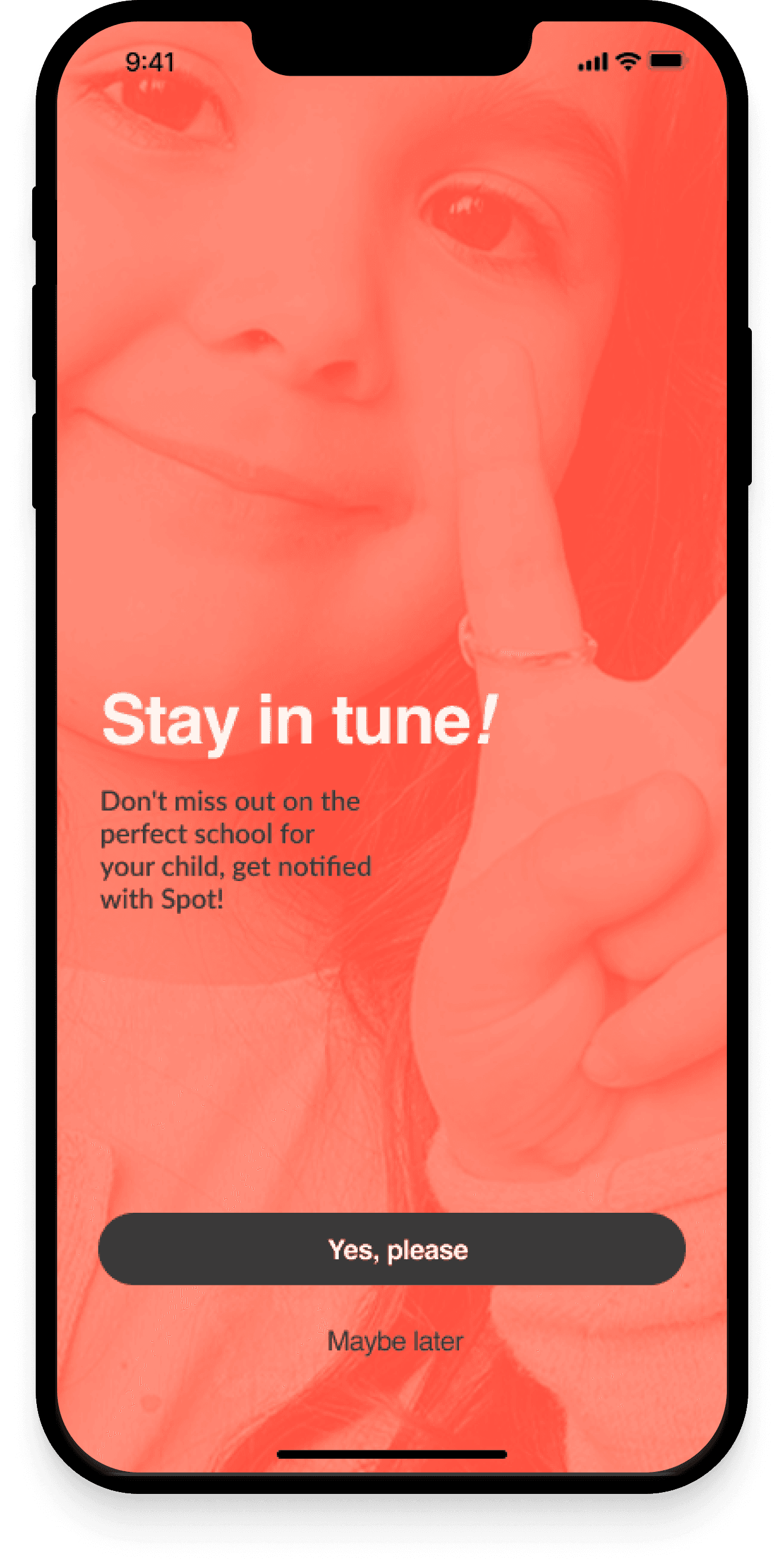
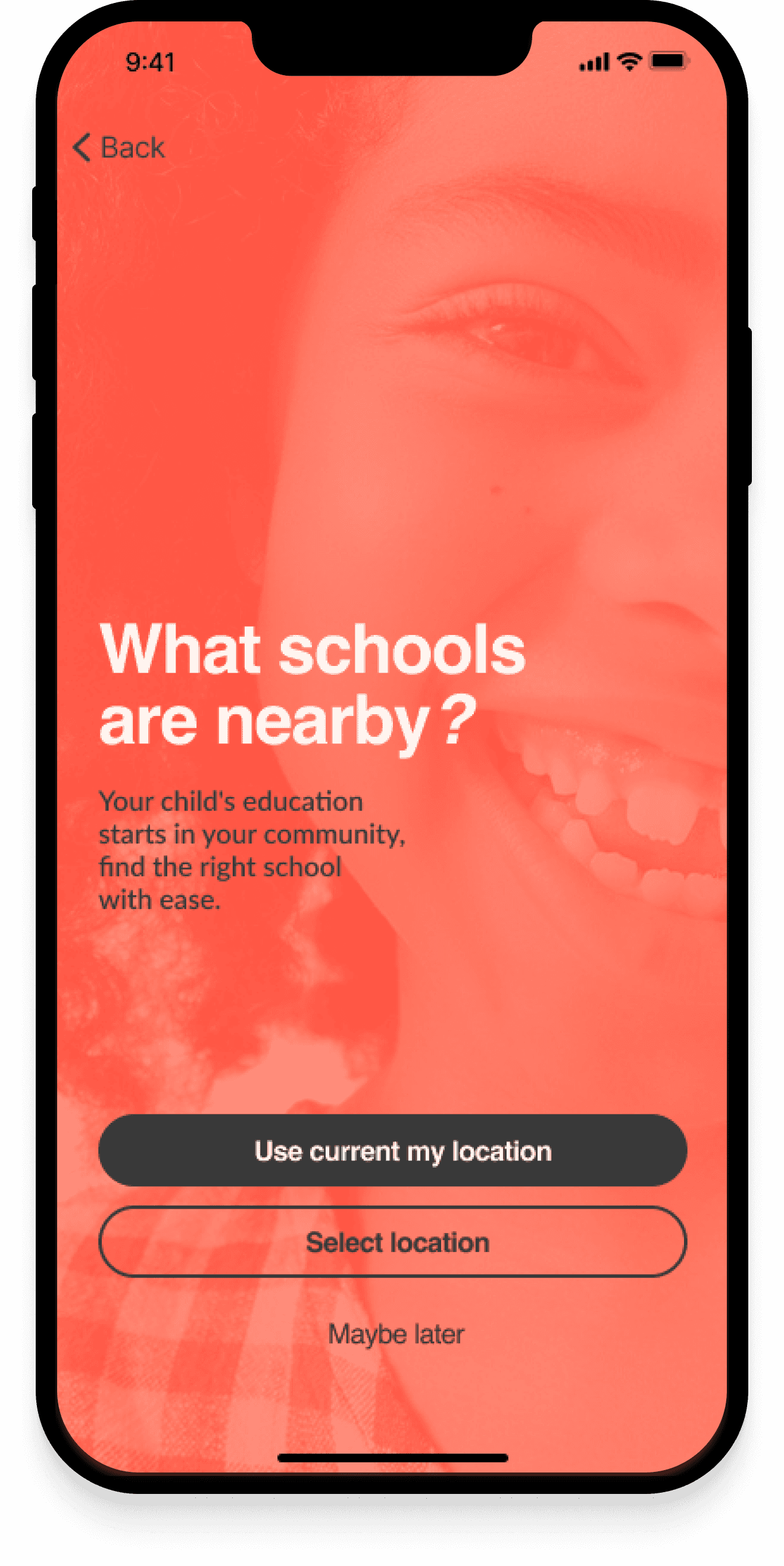
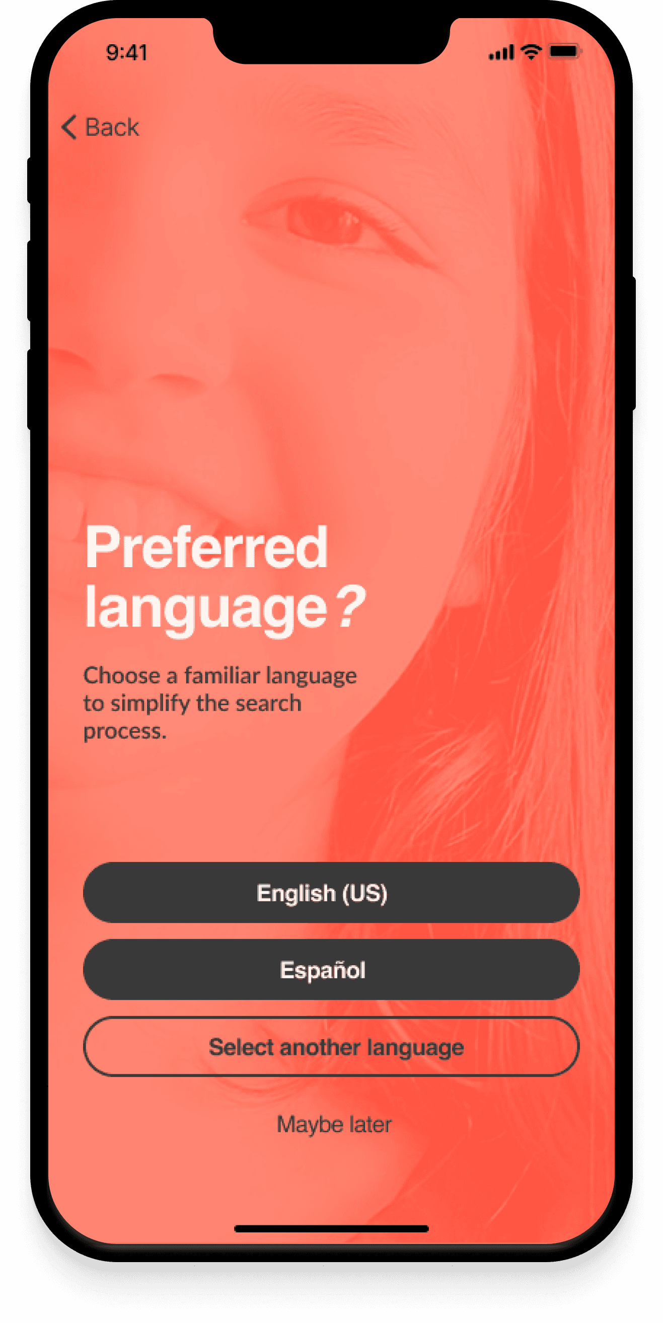
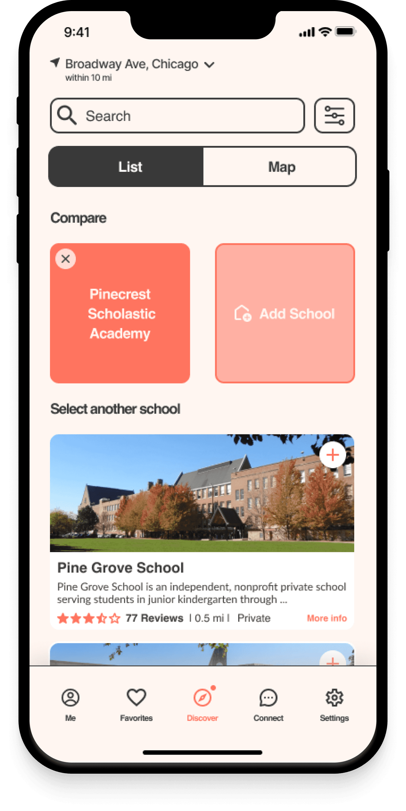
I redesigned the entire comparison tool and displayed it in the Discover Screen. I also implemented Dialogue Boxes to guide users how to use this functionality.
Delivering Solutions
After conducting usability testing, I shifted my focus to the visual aspects of the product. My goal was to create a distinctive brand that would resonate with our users and set us apart from competitors in the market. To achieve this, I expanded the competitive analysis to gather inspiration and identify common stylistic patterns among our competitors.
Usage of Sans-Serif typeface
Usage of color blue and green were dominant
Design Adjectives
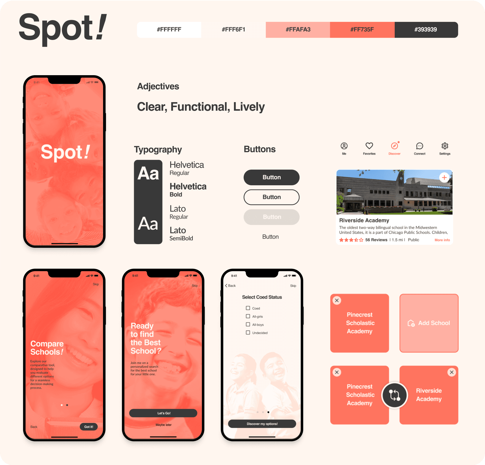
To address parents’s need for supportive space to search for school, I selected brand adjectives that embody clarity, functionality, and liveliness.
Clear
|
Functional
|
Lively
Color Palette
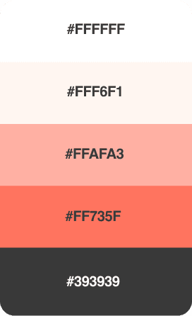
I opted for warm colors that evoke emotions of curiosity, clarity, youthfulness, love, action, and excitement.
text Style
To align with our brand Adjectives, I opted for the timeless and classic typeface Helvetica for the logo and headers. For clear body copy, I chose the simple yet elegant typeface Lato.
Aa
Aa
Helvetica
|
Aa
Aa
Lato
This combination of fonts not only conveys the desired simplicity and effectiveness in my design, but also ensures the longevity and legibility of the product for a wide audience.
Style Tile
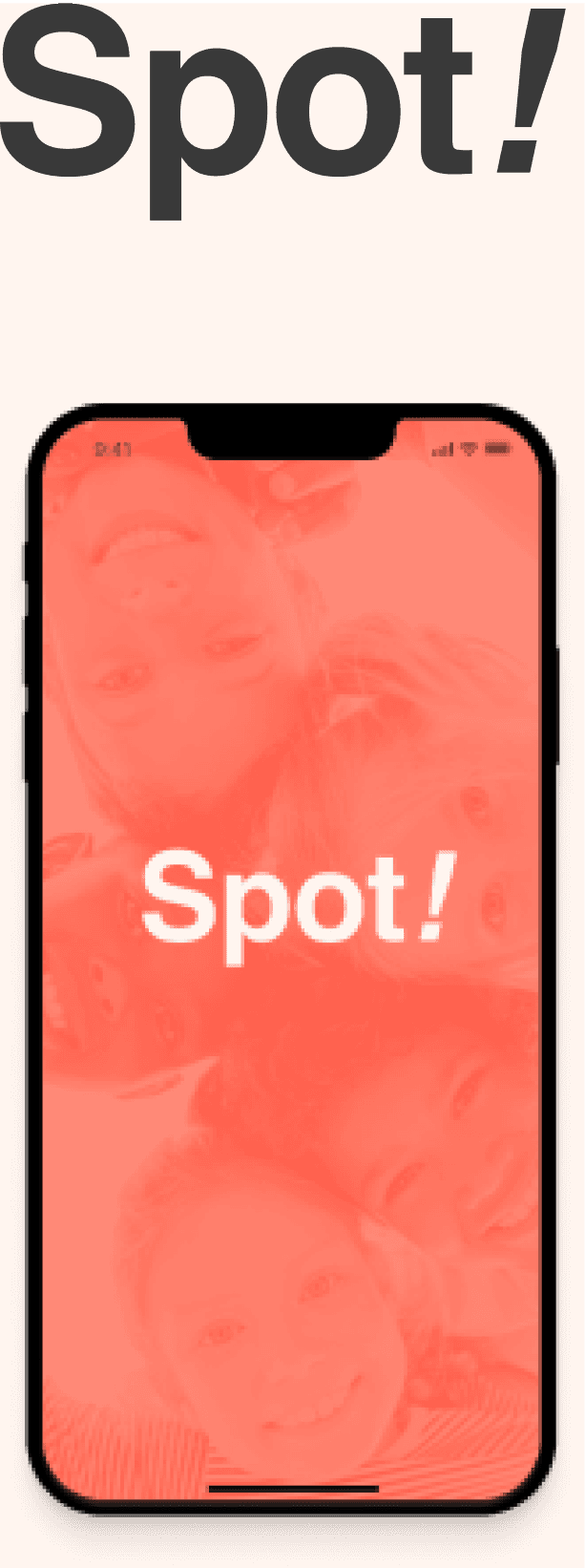
To effectively communicate the desired aesthetic direction and design elements of the project, I developed a Style Tile. This visual reference point served as a guide for stakeholders and I applied it during the development of the High Fidelity Prototype.
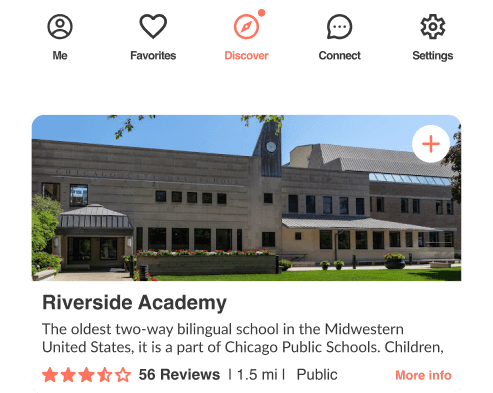
high-Fidelity Screens
Once the branding and color decisions were settled, I harmoniously merged all components of the project.


Conclusions
In conclusion, this case study exemplifies the role of research, user insights, and iterative design processes in shaping a user-centric product for parents navigating the school search journey.
By delving deep into their pain points and preferences, I’ve harnessed the power of empathy to deliver a valuable tool that empowers parents to make informed decisions about their children's education.
Through diligent research methods, including interviews, surveys, and competitive analysis, I’ve gained profound insights into the unique challenges faced by parents.
Armed with this knowledge, I have developed a digital solution that effectively caters to their needs. This solution centralizes information and provides a tool for comparing schools, thereby simplifying the school search process and empowering parents to make informed decisions.
The design journey involved rapid sketching, user flow diagrams, and user testing to ensure a seamless and intuitive user experience. I’ve listened attentively to user feedback, refining and optimizing our product to provide clarity at every touchpoint.
Moreover, I’ve carefully curated a distinctive brand identity that resonates with our target audience, employing a harmonious warm color palette and timeless typography choices. The style tiles serve as a visual compass, guiding stakeholders and fostering alignment throughout the development of the high-fidelity prototype.
Ultimately, this case study highlights the transformative power of user-centered design. By understanding the emotions, aspirations, and pain points of parents, I believe I have crafted a solution that offers parents a trusted companion in their journey for their children's educational success.
Moving Forward
Throughout this project, I have experienced firsthand the importance of empathy in the design process. By conducting an additional interview and fostering emotional bonds with potential users during usability testing, I have deepened my understanding of their needs and challenges. This empathetic approach has not only enriched the design process but has also enabled me to create solutions that truly resonate with users and address their pain points. It has been a pleasure to connect with users on a personal level, building an emotional bond that fuels my passion for creating meaningful and user-centered designs.
Moving forward, I will maintain a strong emphasis on empathy, acknowledging its ability to unlock new possibilities for exceptional user experiences.


School searching made easy
Project Overview
The project's main objective was to enhance the online school search experience for parents of K-12 students. My role revolved around conducting extensive research to gain insights into the needs, preferences, and frustrations of parents during the school search process and then develop and deliver those solutions to high-fidelity. Finally I was responsible for defining the visual identity of the product.
My Role: Research Designer, UX and UI Designer
Duration: 3 weeks
Tools: Figma, Google Forms, Zoom, Photoshop
Platform: Desktop,
IOS Mobile App
The Design Process
Discover:
Domain Research
Competitive Analysis
User Interviews
User Surveys
Define:
Empathy Map
User Flow Diagram
MoSCoW Priority Matrix
Develop
Rapid Sketching
Prototyping
User Testing
Deliver:
Ideation
Style Guide
Hi-Fi Prototype
DISCOVERING
the Problem Space
Prior to diving into competitor and user research, I formulated key questions to guide my next steps and provide a clear direction.
Research questions:
What are the common challenges or frustrations parents face during the school search process?
How do parents currently gather information about potential schools for their children?
What features or functionalities would parents find most valuable in a digital tool designed to support the school selection process?
Competitive Research
To learn about the subject matter and the audience, I employed various research methods and techniques.
I started by performing a competitive analysis to evaluate the strengths and weaknesses of our competitors, as well as to determine the trends and best practices among them.
I covered 4 competitors which are: Niche, Chicago Public Schools, Great Schools and Ours Kids.


I conclude that there were many competitors that were successfully solving that problem. I wanted to discover how successful they are and what are the areas of improvements. The two key insights from the SWOT analysis showed that:
All competitors have a filtering and search system to assist users in refining their school options.
2/4 of competitors provided a mobile application.
User Research: Qualitative Data and Quantitative Data
With the research insights and user in mind, my next step involved conducting in-depth qualitative and quantitative research to gain deeper insights about the target audience. I started by analyzing six given qualitative interviews that provided valuable information about users' needs and expectations.
Using these insights, I used an affinity mapping technique to group and synthesize them, facilitating better comprehension.
An additional interview was conducted and a quantitative user survey was run collectively to validate insights from a larger sample size. A total of 69 participants.
The survey revealed significant insights:


Need for a comparison tool that can assist in making informed decisions when selecting a school.
Need for a diverse selection of schools
Research Findings:
Based on my initial research, I compiled a list of insights that would serve as the foundation and guide my next design decisions.
1- Domain/Competitive
Competitors have a filtering and search system
Few competitors offer a mobile platform to solve the problem
2 competitors are offering a multilingual services
2 - Interviews
School search is time-consuming.
Parents focus on schools in their area in the first steps of the research.
They strongly rely on the community to get information and support and use the internet as a complementary tool.
Parents prioritize their child's wellness above all and also strongly value the school's culture.
3 - Survey:
Need for school comparison tool.
Need for a diverse selection of schools
The Importance of conducting an additional Interview:
After carefully analyzing and synthesizing the data from six initial interviews, I realized that there was still a gap in my understanding of the users' experiences:
The significance of empathy in the design process.
To bridge this gap, I recognized the importance of conducting an additional user interview.
The interview allowed me to connect with users on a deeper level and develop a profound empathy for their challenges empowering me to create solutions that truly address their pain points.
Added warmth to the project
Connected on a deeper level with users
Developed profound empathy for their challenges
Empowered to create effective solutions for users' pain points
I synthesized the research and created the following problem statement:
Parents who lead busy lives and are searching for the optimal school for their kids, often encounter obstacles in getting comprehensive information from a single source and comparing schools, which makes the process time-consuming. As a result, they need a tool that specifically addresses these challenges.
defining and DEVELOPING SOLUTIONS
Once I defined the problem statement, it served as my guiding light for future design decisions. To ensure effective use of my time and resources, I prioritized features based on their relevance to solving the problem.
Through the use of a Moscow map, I categorized features for our platform's MVP (Minimum Viable Product) keeping our users at the forefront.
Guided by the problem statement, the significance of a comparison tool led me to envision a data-driven platform for making informed school comparisons.
Rapid Sketching
I set out to generate a wide array of ideas and potential solutions, aiming to explore both conventional and unconventional approaches by sketching ideas on paper.
In the end, I arrived at an app concept that offers:
An engaging onboarding experience to introduce users to the app's capabilities.
A tailored user experience that helps individuals refine their school choices.
A powerful comparison tool as a core feature.


User Flow Diagram
To ensure a smooth and intuitive user experience, I needed to map out the user interactions within our product before diving into the detailed wire-framing and prototyping.
By creating a user task flow diagram, I visualized the optimal path users would take from the beginning to the end of their journey. This diagram helped me identify potential pain points or decision-making moments that could impact the user experience.
As part of my design strategy, I introduced a "Skip button” feature, allowing users to bypass the onboarding and presentation steps, as well as the personalized experience, if they desired. This streamlined access to the core features of the app and catered to users who preferred a quicker route to their desired outcomes.


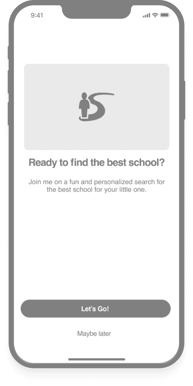
Next, I transitioned to a mid-fidelity prototype, a more concrete embodiment of the design. This prototype included essential components and interactions to guide users through the defined user tasks. By identifying and addressing usability issues at this stage, I aimed to avoid time-consuming changes in later design phases.
Learnings from User Testing
As a passionate designer, interacting with users and gathering live feedback brings the project to life. I conducted user testing with three parents to assess the usability and functionality of the prototype. The user testing process was really enjoyable, and it provided unexpected insights that greatly influenced my design decisions.
Notifications/location screens: 2/3 of users opted not to activate notifications but shared their location with the "Only While Using the App" option.


Personalized Experience: Users consistently clicked on the name instead of ticking the box to make their selection, leading to confusion.


Discover Screen:
Only one user noticed the popup signifier call-to-action (CTA) for the Share button on the Discover page.
2/3 of the users accessed the Compare page using the comparison button located on the bottom menu.


Comparison Screen:
Interaction with the comparison tool using the CTA “Switch” on the bottom left allowed users to switch panels
Users could save favorites successfully.


Solutions from testing
To maintain a seamless user experience, I moved notification, location and language settings to the end of the onboarding process.


I redesigned the entire comparison tool and displayed it in the Discover Screen. I also implemented Dialogue Boxes to guide users how to use this functionality.


Delivering Solutions
After conducting usability testing, I shifted my focus to the visual aspects of the product. My goal was to create a distinctive brand that would resonate with our users and set us apart from competitors in the market. To achieve this, I expanded the competitive analysis to gather inspiration and identify common stylistic patterns among our competitors.
Usage of Sans-Serif typeface
Usage of color blue and green were dominant
Design Adjectives
To address parents’s need for supportive space to search for school, I selected brand adjectives that embody clarity, functionality, and liveliness.
Clear
Functional
Lively
Color Palette
I opted for warm colors that evoke emotions of curiosity, clarity, youthfulness, love, action, and excitement.
text Style
To align with our brand Adjectives, I opted for the timeless and classic typeface Helvetica for the logo and headers. For clear body copy, I chose the simple yet elegant typeface Lato.
Aa
Aa
Helvetica
Aa
Aa
Lato
This combination of fonts not only conveys the desired simplicity and effectiveness in my design, but also ensures the longevity and legibility of the product for a wide audience.
Style Tile
To effectively communicate the desired aesthetic direction and design elements of the project, I developed a Style Tile. This visual reference point served as a guide for stakeholders and I applied it during the development of the High Fidelity Prototype.

Adjectives
Clear
Functional
Lively
Typography
Aa
Aa
Helvetica
Regular
Helvetica
Bold
Lato
Regular
Lato
SemiBold

Buttons
Button
Button
Button
Button





high-Fidelity Screens
Once the branding and color decisions were settled, I harmoniously merged all components of the project.


Conclusions
In conclusion, this case study exemplifies the role of research, user insights, and iterative design processes in shaping a user-centric product for parents navigating the school search journey.
By delving deep into their pain points and preferences, I’ve harnessed the power of empathy to deliver a valuable tool that empowers parents to make informed decisions about their children's education.
Through diligent research methods, including interviews, surveys, and competitive analysis, I’ve gained profound insights into the unique challenges faced by parents.
Armed with this knowledge, I have developed a digital solution that effectively caters to their needs. This solution centralizes information and provides a tool for comparing schools, thereby simplifying the school search process and empowering parents to make informed decisions.
The design journey involved rapid sketching, user flow diagrams, and user testing to ensure a seamless and intuitive user experience. I’ve listened attentively to user feedback, refining and optimizing our product to provide clarity at every touchpoint.
Moreover, I’ve carefully curated a distinctive brand identity that resonates with our target audience, employing a harmonious warm color palette and timeless typography choices. The style tiles serve as a visual compass, guiding stakeholders and fostering alignment throughout the development of the high-fidelity prototype.
Ultimately, this case study highlights the transformative power of user-centered design. By understanding the emotions, aspirations, and pain points of parents, I believe I have crafted a solution that offers parents a trusted companion in their journey for their children's educational success.
Moving Forward
Throughout this project, I have experienced firsthand the importance of empathy in the design process. By conducting an additional interview and fostering emotional bonds with potential users during usability testing, I have deepened my understanding of their needs and challenges. This empathetic approach has not only enriched the design process but has also enabled me to create solutions that truly resonate with users and address their pain points. It has been a pleasure to connect with users on a personal level, building an emotional bond that fuels my passion for creating meaningful and user-centered designs.
Moving forward, I will maintain a strong emphasis on empathy, acknowledging its ability to unlock new possibilities for exceptional user experiences.


School searching made easy
Project Overview
The project's main objective was to enhance the online school search experience for parents of K-12 students. My role revolved around conducting extensive research to gain insights into the needs, preferences, and frustrations of parents during the school search process and then develop and deliver those solutions to high-fidelity. Finally I was responsible for defining the visual identity of the product.
My Role: Research Designer, UX and UI Designer
Duration: 3 weeks
Tools: Figma, Google Forms, Photoshop
Platform: IOS Mobile App
The Design Process
Discover:
Domain Research
Competitive Analysis
User Interviews
User Surveys
Define:
Empathy Map
User Flow Diagram
MoSCoW Priority Matrix
Develop
Rapid Sketching
Prototyping
User Testing
Deliver:
Ideation
Style Guide
Hi-Fi Prototype
DISCOVERING the Problem Space
Prior to diving into competitor and user research, I formulated key questions to guide my next steps and provide a clear direction.
Research questions:
What are the common challenges or frustrations parents face during the school search process?
How do parents currently gather information about potential schools for their children?
What features or functionalities would parents find most valuable in a digital tool designed to support the school selection process?
Competitive Research
To learn about the subject matter and the audience, I employed various research methods and techniques.
I started by performing a competitive analysis to evaluate the strengths and weaknesses of our competitors, as well as to determine the trends and best practices among them.
I covered 4 competitors which are: Niche, Chicago Public Schools, Great Schools and Ours Kids.


I conclude that there were many competitors that were successfully solving that problem. I wanted to discover how successful they are and what are the areas of improvements. The two key insights from the SWOT analysis showed that:
All competitors have a filtering and search system to assist users in refining their school options.
2/4 of competitors provided a mobile application.
User Research: Qualitative Data and Quantitative Data
With the research insights and user in mind, my next step involved conducting in-depth qualitative and quantitative research to gain deeper insights about the target audience. I started by analyzing six given qualitative interviews that provided valuable information about users' needs and expectations.
Using these insights, I used an affinity mapping technique to group and synthesize them, facilitating better comprehension.
An additional interview was conducted and a quantitative user survey was run collectively to validate insights from a larger sample size. A total of 69 participants.
The survey revealed significant insights:
Need for a comparison tool that can assist in making informed decisions when selecting a school.
Need for a diverse selection of schools


Research Findings:
Based on my initial research, I compiled a list of insights that would serve as the foundation and guide my next design decisions.
Domain/Competitive
Competitors have a filtering and search system
Few competitors offer a mobile platform to solve the problem
2 competitors are offering a multilingual services
Interviews
School search is time-consuming.
Parents focus on schools in their area in the first steps of the research.
They strongly rely on the community to get information and support and use the internet as a complementary tool.
Parents prioritize their child's wellness above all and also strongly value the school's culture.
Survey:
Need for school comparison tool.
Need for a diverse selection of schools
The Importance of conducting an additional Interview:
After carefully analyzing and synthesizing the data from six initial interviews, I realized that there was still a gap in my understanding of the users' experiences:
The significance of empathy in the design process.
To bridge this gap, I recognized the importance of conducting an additional user interview.
The interview allowed me to connect with users on a deeper level and develop a profound empathy for their challenges empowering me to create solutions that truly address their pain points.
Added warmth to the project
Connected on a deeper level with users
Developed profound empathy for their challenges
Empowered to create effective solutions for users' pain points
I synthesized the research and created the following problem statement:
Parents who lead busy lives and are searching for the optimal school for their kids, often encounter obstacles in getting comprehensive information from a single source and comparing schools, which makes the process time-consuming. As a result, they need a tool that specifically addresses these challenges.
defining and DEVELOPING SOLUTIONS
Once I defined the problem statement, it served as my guiding light for future design decisions. To ensure effective use of my time and resources, I prioritized features based on their relevance to solving the problem.
Through the use of a Moscow map, I categorized features for our platform's MVP (Minimum Viable Product) keeping our users at the forefront.
Guided by the problem statement, the significance of a comparison tool led me to envision a data-driven platform for making informed school comparisons.
Rapid Sketching
I set out to generate a wide array of ideas and potential solutions, aiming to explore both conventional and unconventional approaches by sketching ideas on paper.
In the end, I arrived at an app concept that offers:
An engaging onboarding experience to introduce users to the app's capabilities.
A tailored user experience that helps individuals refine their school choices.
A powerful comparison tool as a core feature.


User Flow Diagram
To ensure a smooth and intuitive user experience, I needed to map out the user interactions within our product before diving into the detailed wire-framing and prototyping.
By creating a user task flow diagram, I visualized the optimal path users would take from the beginning to the end of their journey. This diagram helped me identify potential pain points or decision-making moments that could impact the user experience.
As part of my design strategy, I introduced a "Skip button” feature, allowing users to bypass the onboarding and presentation steps, as well as the personalized experience, if they desired. This streamlined access to the core features of the app and catered to users who preferred a quicker route to their desired outcomes.


Next, I transitioned to a mid-fidelity prototype, a more concrete embodiment of the design. This prototype included essential components and interactions to guide users through the defined user tasks. By identifying and addressing usability issues at this stage, I aimed to avoid time-consuming changes in later design phases.
Learnings from User Testing
As a passionate designer, interacting with users and gathering live feedback brings the project to life. I conducted user testing with three parents to assess the usability and functionality of the prototype. The user testing process was really enjoyable, and it provided unexpected insights that greatly influenced my design decisions.
Notifications/location screens: 2/3 of users opted not to activate notifications but shared their location with the "Only While Using the App" option.


Personalized Experience: Users consistently clicked on the name instead of ticking the box to make their selection, leading to confusion.
Discover Screen:
Only one user noticed the popup signifier call-to-action (CTA) for the Share button on the Discover page.
2/3 of the users accessed the Compare page using the comparison button located on the bottom menu.


Comparison Screen:
Interaction with the comparison tool using the CTA “Switch” on the bottom left allowed users to switch panels
Users could save favorites successfully.
Solutions from testing
To maintain a seamless user experience, I moved notification, location and language settings to the end of the onboarding process.


I redesigned the entire comparison tool and displayed it in the Discover Screen. I also implemented Dialogue Boxes to guide users how to use this functionality.



Delivering Solutions
After conducting usability testing, I shifted my focus to the visual aspects of the product. My goal was to create a distinctive brand that would resonate with our users and set us apart from competitors in the market. To achieve this, I expanded the competitive analysis to gather inspiration and identify common stylistic patterns among our competitors.
Usage of Sans-Serif typeface
Usage of color blue and green were dominant
Design Adjectives
To address parents’s need for supportive space to search for school, I selected brand adjectives that embody clarity, functionality, and liveliness.
Clear
|
Functional
|
Lively
Color Palette
I opted for warm colors that evoke emotions of curiosity, clarity, youthfulness, love, action, and excitement.
text Style
To align with our brand Adjectives, I opted for the timeless and classic typeface Helvetica for the logo and headers. For clear body copy, I chose the simple yet elegant typeface Lato.
Aa
Aa
Helvetica
|
Aa
Aa
Lato
This combination of fonts not only conveys the desired simplicity and effectiveness in my design, but also ensures the longevity and legibility of the product for a wide audience.
Style Tile
To effectively communicate the desired aesthetic direction and design elements of the project, I developed a Style Tile. This visual reference point served as a guide for stakeholders and I applied it during the development of the High Fidelity Prototype.


high-Fidelity Screens
Once the branding and color decisions were settled, I harmoniously merged all components of the project.


Conclusions
In conclusion, this case study exemplifies the role of research, user insights, and iterative design processes in shaping a user-centric product for parents navigating the school search journey.
By delving deep into their pain points and preferences, I’ve harnessed the power of empathy to deliver a valuable tool that empowers parents to make informed decisions about their children's education.
Through diligent research methods, including interviews, surveys, and competitive analysis, I’ve gained profound insights into the unique challenges faced by parents.
Armed with this knowledge, I have developed a digital solution that effectively caters to their needs. This solution centralizes information and provides a tool for comparing schools, thereby simplifying the school search process and empowering parents to make informed decisions.
The design journey involved rapid sketching, user flow diagrams, and user testing to ensure a seamless and intuitive user experience. I’ve listened attentively to user feedback, refining and optimizing our product to provide clarity at every touchpoint.
Moreover, I’ve carefully curated a distinctive brand identity that resonates with our target audience, employing a harmonious warm color palette and timeless typography choices. The style tiles serve as a visual compass, guiding stakeholders and fostering alignment throughout the development of the high-fidelity prototype.
Ultimately, this case study highlights the transformative power of user-centered design. By understanding the emotions, aspirations, and pain points of parents, I believe I have crafted a solution that offers parents a trusted companion in their journey for their children's educational success.
Moving Forward
Throughout this project, I have experienced firsthand the importance of empathy in the design process. By conducting an additional interview and fostering emotional bonds with potential users during usability testing, I have deepened my understanding of their needs and challenges. This empathetic approach has not only enriched the design process but has also enabled me to create solutions that truly resonate with users and address their pain points. It has been a pleasure to connect with users on a personal level, building an emotional bond that fuels my passion for creating meaningful and user-centered designs.
Moving forward, I will maintain a strong emphasis on empathy, acknowledging its ability to unlock new possibilities for exceptional user experiences.
Case Studies:
|
haydn.ai
Let’s Connect!
Interested in working together or having a coffee chat?
Hit me up with a message, and let's talk!